
Interface Hall of Shame or Fame - PowerPoint PPT Presentation
1 / 28
Title:
Interface Hall of Shame or Fame
Description:
Human visual system. Color perception. Administrivia. Color deficiency ... Visual Illusions (not color) Can you guess the woman's age? Keep looking. 2/24/99 ... – PowerPoint PPT presentation
Number of Views:243
Avg rating:3.0/5.0
Title: Interface Hall of Shame or Fame
1
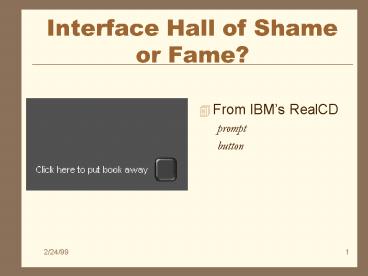
Interface Hall of Shame or Fame?
- From IBMs RealCD
- prompt
- button
2
Interface Hall of Shame !
- From IBMs RealCD
- prompt
- button
- Black on black????
- cool!
- but you cant see it
- click here... shouldnt be necessary
3
Color, Vision, Perception
- CS 160, Spring 1999
- Professor L.A. Rowe
- February 24, 1999
4
Outline
- Human visual system
- Color perception
- Administrivia
- Color deficiency
- Guidelines for design
5
Why Study Color?
Color can be a powerful tool to improve user
interfaces, but its inappropriate use can
severely reduce the performance of the systems we
build.
6
Visible Spectrum
7
Human Visual System
- Light passes through lens
- Focussed on retina
8
Retina
- Retina covered with light-sensitive receptors
- rods
- primarily for night vision perceiving movement
- sensitive to broad spectrum of light
- cant discriminate between colors
- sense intensity or shades of gray
- cones
- used to sense color
9
Retina
10
Retina
- Center of retina has most of the cones
- allows for high acuity of objects focused at
center - Edge of retina is dominated by rods
- allows detecting motion of threats in periphery
11
Color Perception via Cones
- Photopigments used to sense color
- 3 types blue, green, red (really yellow)
- each sensitive to different band of spectrum
- ratio of neural activity of the 3 ? color
- re-coded sent to brain as
- R-G gives red or green color perception
- RG gives perception of brightness yellow (Y)
- Y-B gives yellow or blue color perception
12
Color Sensitivity
Really yellow
13
Distribution of Photopigments
- Not distributed evenly
- mainly reds (64) very few blues (4)
- insensitivity to short wavelengths (cyan to
deep-blue) - high sensitivity to long wavelengths (yellow
orange) - Center of retina (high acuity) has no blue cones
- disappearance of small blue objects you fixate on
14
Color Sensitivity Image Detection
- Most sensitive to the center of the spectrum
- blues reds must be brighter than greens
yellows - Brightness determined mainly by RG
- expressed on a scale of luminance
- light energy corrected for wavelength sensitivity
- Shapes detected by finding edges
- combine brightness color differences for
sharpness - Implications?
- hard to deal w/ blue edges blue shapes
15
Color Sensitivity (cont.)
- As we age
- lens yellows absorbs shorter wavelengths
- sensitivity to blue is even more reduced
- fluid between lens and retina absorbs more light
- perceive a lower level of brightness
- Implications?
- dont rely on blue for text or small objects!
16
Focus
- Different wavelengths of light focused at
different distances behind eyes lens - need for constant refocusing (causes fatigue)
- careful about color combinations
- Red objects appear closer than blue objects
- Pure (saturated) colors require more focusing
then less pure (desaturated)
17
What Happens with Age?
- Opening/closing iris slows down
- Means you should not have rapid changes
- Most people lose vision
- Need glasses
- Need bifocals
- Go blind?
- Very frustrating!
18
Color Deficiency (color blindness)
- Trouble discriminating colors
- besets about 9 of population
- Different photopigment response
- reduces capability to discern small color
differences (particularly those of low
brightness) - most common
- Red-green deficiency is best known
- lack of either green or red photopigment (cant
discriminate colors dependent on R G)
19
UI Hall of Fame or Shame?
- Dialog box
- ask if you want to delete
- yes (green)
- no (red)
20
UI Hall of Fame or Shame?
- Dialog box
- ask if you want to delete
- yes (green)
- no (red)
- Problems?
- R-G color deficiency
- cultural mismatch
- Western
- green good
- red bad
- Eastern others differ
21
Color Components
- Hue
- property of the wavelengths of light (i.e.,
color) - Lightness
- how much light appears to be reflected from a
surface - some hues are inherently lighter or darker
- Saturation
- purity of the hue
- e.g., red is more saturated than pink
- color is mixture of pure hue achromatic color
- portion of pure hue is the degree of saturation
22
Color Components (cont.)
- Lightness
- Saturation
23
Visual Illusions (not color)
Can you guess the womans age? Keep looking.
24
Color Guidelines
- Avoid simultaneous display of highly saturated,
spectrally extreme colors - e.g., no cyans/blues at the same time as reds,
why? - refocusing!
- desaturated combinations are better ? pastels
- Opponent colors go well together
- (red green) or (yellow blue)
25
Pick Non-adjacent Colors on the Hue Circle
26
Color Guidelines (cont.)
- Size of detectable changes in color varies
- hard to detect changes in reds, purples, greens
- easier to detect changes in yellows blue-greens
- Older users need higher brightness levels to
distinguish colors - Hard to focus on edges created by color alone
- use both brightness color differences)
27
Color Guidelines (cont.)
- Avoid red green in the periphery
- yellows blues work well in periphery
- Avoid pure blue for text, lines, small shapes
- blue makes a fine background color
- avoid adjacent colors that differ only in blue
- Avoid single-color distinctions
- mixtures of colors should differ in 2 or 3 colors
28
Summary
- Color can be very helpful, but
- Pay attention to
- how colors combine
- human perception
- people with color deficiency
- Be sensitive to people with limitations
- color blindness, near/far sighted, and focusing
speed
Recommended
CrystalGraphics Presentations


