
Histograms PowerPoint PPT Presentation
1 / 12
Title: Histograms
1
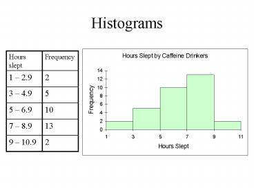
Histograms
2
Titled
Vertical Axis Shows Frequencies
Starts at 0. Graphs that cut off some values can
be misleading
Be sure to clearly label axes with quantity
measured and units (when appropriate)
3
5.0 would be included in this bar
Lower class limits used as class boundary
4
Relative Frequency Histogram
5
Bar Graph (alternate form of a histogram)
6
Frequency Polygon
7
Ogive (Cumulative Frequency Polygon)
8
Stem and Leaf Plot(variant of histogram that
shows all data)
- Data 1.2, 2.9, 3.1, 3.5, 4.1, 4.6, 4.8, 5.0,
5.3, 5.3, 5.4, 5.7, 6.3, 6.7, 6.7, 6.8, 6.9, 7.0,
7.1, 7.2, 7.2, 7.4, 7.5, 7.5, 7.8, 8.1, 8.2, 8.2,
8.5, 8.6, 9.3, 10.1
9
Pie Charts
10
Pareto Chart
- For Qualitative data
- Can also be used for Nominal level data
- For Ordinal level data, you would want your
horizontal axis in order
Data groups are arranged in order of decreasing
size
11
Scatterplot
- Pairs each value from data set to a value from a
second data set to create points.
12
Homework
- 2-3 1, 3, 5, 7
Recommended
