The principles - PowerPoint PPT Presentation
1 / 31
Title: The principles
1
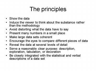
The principles
- Show the data
- Induce the viewer to think about the substance
rather than the methodology - Avoid distorting what the data have to say
- Present many numbers in a small place
- Make large data sets coherent
- Encourage the eyes to compare different pieces of
data - Reveal the data at several levels of detail
- Serve a reasonable clear purpose description,
exploration, tabulation, or decoration - Be closely integrated with the statistical and
verbal descriptions of a data set
2
Graphics Excellence
- Well-designed presentation of interesting data
a matter of substance, of statistics, and of
design - Consists of complex ideas communicated with
clarity, precision, and efficiency - Gives the viewer the greatest number of ideas in
the shortest time with the least ink in the
smallest place - We will show examples from four different types
of data - Data maps
- Time-series
- Space-time narrative designs
- Relational graphics
3
Data Maps
- The early data map rarely contains any additional
information other than the geographical map
itself
4
The First Data Maps
- 1868 by Edmond Halley
- Show trade winds over a geographical map
- The first flow visualization example!!
5
John Snows Cholera Map
- 1854 cholera outbreak
- Deaths were marked by dots
- Also showed the locations of water pump
6
Modern Data Map
- Computerized cartography have increased the data
density by 5000- or more fold - The map here shows the distribution of 1.3
million galaxies in the northern hemisphere - Divide the sky into 1024 x 2222 rectangles
- The intensity represents the number of galaxies
counted - Clusters become much easier to spot, although the
linear structure might be non-meaningful
7
Time-Series Data
- A planetary orbits as a function of time produced
at the 10th century - The next time-series graphic showed at 800 years
later
8
Mareys Train Schedule
- Paris to Lyon, 1880
- Stations are separated in proportion to their
distances - Slope reflects speed
9
Mareys Train Schedule
- The path of modern TGV
10
Time-Series Data
- Playfair who invented bar chart
- Graphics were preferable to showed the shape of
data in a comparative perspective
11
Time-Series Data
- A simple passage of time is usually not a good
explanatory variable - One exception
12
Mareys Chronophotography
- Man in black - show space and time simultaneously
13
Narrative Graphics of Space and Time
- Minards Napoleons invasion to Russia
14
LA Air Pollutions
- Small multiples (LA Times, 1979)
This visualization contains 28,800 readings over
2400 spatial location
15
Relational Graphics
- Temperature and thermal conductivity of copper
from hundreds of studies
16
Escaping Flatland
- The information world is inevitably multivariate
in nature - Our display is 2-dimensional
- An essential task of envisioning information
- To increase the number of dimensions
- To increase data density
- Several examples and design strategies of
escaping flatland
17
Tour Map
- Guide for visiting to Ise Shrine (1948)
- A change in design accomodates a change in the
scale of the map
18
Sun Spots Observation
- Galileo 1610 marked spots directly onto paper
flatland
Small Multiples
Christopher Scheiner illustrated the
observation data using small multiples, indexed
by time (1613)
Galileos pencil recorded data
19
Sun Spots Visualization
- To help tracking individual sun spots in time,
Christopher Scheiner arrayed apparent paths of
spots on a single disk
Data Compression
20
Sun Spot Visualizatoin
- Dimension reduction Butterfly diagram, Maunder
1904
21
Sun Spots
- Parallel Sequence with additional variables (J.
of the British Astronomical Association)
Butterfly with flapping wins (Micro/Macro
Readings)
percentage of sun covered by sun spots
22
Principles with Sun Spots Observations
- Visual mapping from raw data
- Small multiples
- Dimensionality and data compression
- Parallel sequencing
- Micro/macro readings
23
Java Railroad
- Classified document for Japanese invasion
24
Dance Notation
- Time-sequence of gestures and motions (4D
representation) - Depicting movement
25
Weather Forecast
- Weather forecast from a japanese newspaper
26
Childrens Shirts
- Small multiple enforces local comparisons
- The heart of visual reasoning see, distinguish,
and choose
27
Visual Representation of Quantities
- The Urge to See (Prague, 1968)
28
Strategies
- Direct Labels (the watch)
- Encoding (shadows)
- Self-representing Scales (tanks surround the
buildings)
29
Numerical Storms
- Good and bad examples
How big is the cloud? What direction is it
moving? The fundamentals of scales, orientation,
and labels are missing The grid becomes
visually dominant
30
About Visual Integrity
- Video flyover of planet Venus takes the viewers
on a rollercoaster of steep canyons and mountains
by NASA - In fact, the video is a result of vertical
exaggeration by 22.5 times - No information was provided to the viewers
31
Banking to the 45
- Appropriate re-scaling does help sometimes
- Reveal to the cycle trend


