
Microsoft Excel Charts - PowerPoint PPT Presentation
1 / 13
Title:
Microsoft Excel Charts
Description:
Visual presentation of differences, similarities, general trends in data ... Not all types of charts are ... meat, buns, corn relish are discreet items ... – PowerPoint PPT presentation
Number of Views:75
Avg rating:3.0/5.0
Title: Microsoft Excel Charts
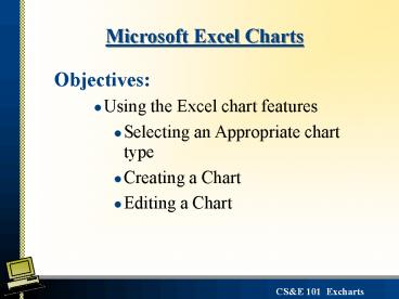
1
Microsoft Excel Charts
- Objectives
- Using the Excel chart features
- Selecting an Appropriate chart type
- Creating a Chart
- Editing a Chart
2
Charts
- Why are charts useful?
- Visual presentation of differences, similarities,
general trends in data - Easier to view and interpret at a glance
- Chart layout - terminology
- Types of charts
- Deciding which type of chart is appropriate for
the problem at hand
3
Chart Title
Plot Area
Legend
Y Axis
X Axis
Category-Axis Title
4
Selecting an Appropriate Chart
- Not all types of charts are appropriate for all
data presentation needs - Line/Area Charts show changes or trends - Data
points are plotted at equal intervals - Example how the outside temperature changed over
a 15 hour period. Temperature is not a function
of the time of day - it varies based on the
meteorological variables.
5
A line chart shows a trend with each point
plotted at equal intervals
Notice how the distance on the x axis from 8-9am
is the same as from 9-11am
6
Selecting an Appropriate Chart
- XY Charts show a functional relationship between
two or more variables. - Data points are plotted at Scaled intervals -
- Example Yearly Income on your investment at
different percentage interest rates.
7
An XY chart plots two sets of data at scaled
intervals
Notice how the data points are not distributed
evenly but along a scaled x axis of interest rate
8
Selecting an Appropriate Chart
- Bar/Column Charts show and compare discrete
objects - Example Cost components of food items for various
size groups at a picnic - meat, buns, corn relish are discreet items
- can stack these charts to add another dimension
of data such as costs for each item by group size
- small, medium and large groups
9
(No Transcript)
10
Selecting an Appropriate Chart
- Pie Charts display parts that make up a whole
- Example Percentage cost component of each
food item of a meal for a given group size. - Use when its you a emphasizing the portion of a
whole rather than how much the whole equals.
So we want to know what item is the largest cost
component rather than how much that component
cost.
11
(No Transcript)
12
Creating a Chart - Walkthrough
- Select data range
- continuous and contiguous data
- Click on Insert Ribbon and choose chart type
- Select chart headings, axis, labels etc from
Layout Ribbon - Modify chart formatting from the Format Ribbon
13
Editing a Chart Walkthrough
- Double click on the chart to select it - use
context sensitive ribbons to select features
Design Ribbon
Layout Ribbon
Format Ribbon
Recommended
CrystalGraphics Presentations


![get [PDF] Download EXCEL CHARTS AND GRAPHS NINJA: The Best and Fastest Program to Become a PowerPoint PPT Presentation](https://s3.amazonaws.com/images.powershow.com/10086600.th0.jpg?_=20240726086)


