Poster research/ analysis - PowerPoint PPT Presentation
Title: Poster research/ analysis
1
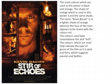
The main colours which are used in this poster is
black and orange. The shade of orange which is
used in this poster is not the same shade. The
name Kevin Bacon is in a lighter shade of
orange whereas the face of the man appears to be
mixed with the colour red. The colours used have
connotations fire and hell. The colours which
are used help indicate the type of genre of the
film as it is dark and fiery, which suggests
passion and battles.
2
The layout of this poster may convey the
emotional state of the main person. He appears to
be behind a type of door looking at what is on
the other side or he is entering into the
darkness and horrors which are within the
location which could be a house. This is
suggestive of the position of his head as the
entire face cannot be seen. Furthermore the
lighting on the face helps support this.
The poster is interesting but in terms of what
has been included however it is also basic
following the normal conventions of a movie
poster.
3
Name of the movie, a grunge font has been used
but it is still easy to read the title/ It is the
same font as what the actors name is written in.
this is effective as it does not bring too much
attention away from the title of the movie or the
poster images. . The fact that the name of the
actor is shown below his image, and he is in the
centre third of the page suggests that the actor
used, was chosen to help promote and sell the
movie to a specific audience.
I think that this poster gives the audience
information visually in the form of images rather
than through writing. Most of images are
appealing. The writing on the poster includes the
standard bullet box containing the names of the
actors and website of the movie. This also is
another way, for the movie to be promoted to get
people to watch it.
4
These mini images could be from scenes in the
movie. The fact that these are positioned on the
outside helping creating the object of a door. I
think that having these images help make the film
more intriguing and helps target an audience. It
also raises questions to what happens in the
movie, with the only way to find out is by going.
For this reason I think that this poster is a
good selling advertisement for the movie. In a
similar way he name of the actor is also on the
poster.
Close of a mans face most likely the person the
movie is centred around. The man is connecting
with the audience as he is looking straight at
them.


