Guidelines for brochure designing - PowerPoint PPT Presentation
Title:
Guidelines for brochure designing
Description:
Here are few do's and dont's for designing a brochure so that you can make a perfect brochure for your company. – PowerPoint PPT presentation
Number of Views:59
Title: Guidelines for brochure designing
1
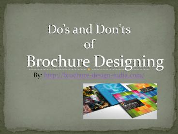
Dos and Don'ts of Brochure Designing
By http//brochure-design-india.com/
2
A brochure can be of a single page or in a
booklet form. It includes pictures, texts,
details about the products and the services
offered by the company. Brochures are used as a
marketing tool for any type of business. A
brochure should be designed in an attractive way
as compared to the competitors. As each kind of
product has a brochure of its own. These dos
and donts will be helpful for designing brochure.
3
- Front page should be attractive
Cover page of the brochure should be attractive
so that the readers are bound to read the whole
brochure. The first page should depict the
services provided by the company and highlight
the theme reflecting the services and products of
the company.
4
- Make your readers active
Most important is to give your address and
contact number on the brochure. Your brochure
should encourage the readers to visit the nearest
store of your company or make a phone call, reply
to a postcard.
5
- Keep the content precise
You should keep the content simple and to the
point. The language of the text should able to
convey the message you want to convey through
brochure. The sentences should be short .
6
- A big NO to grammatical error
Grammatical errors reflects a bad impression of
your company. It shows a casual nature towards
the company. So you should be careful about the
grammar
7
- Avoid use of too many fonts
Use of too many fonts spoils the design of the
whole of the brochure. More than two type of
fonts should be avoided. Use of long sentences
should also be avoided.
8
- No price list in brochure
You should not list the prices in a brochure as
they tend to change soon. Your brochure should be
updated. Recent information should be present
about the services for brochure design.
9
Brochure Design IndiaY8, Block - EP, Sector
VSalt Lake, Kolkata - 700091, INDIAPh 91 33
4020 0838Fax 91 33 4020 0856Email
info_at_brochure-design-india.comWeb
http//www.brochure-design-india.com
10
(No Transcript)

