Balance - PowerPoint PPT Presentation
1 / 25
Title:
Balance
Description:
Elements at the center of a composition pull less weight than those lying of the ... the map functions to bring the cartographer and map reader closer together and ... – PowerPoint PPT presentation
Number of Views:126
Avg rating:3.0/5.0
Title: Balance
1
Map Design and Layout
Balance
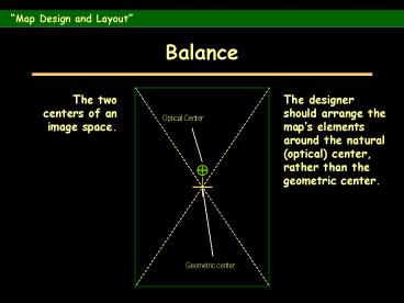
The two centers of an image space.
The designer should arrange the maps elements
around the natural (optical) center, rather than
the geometric center.
2
Map Design and Layout
Visual Balance
- Visual balance results from two major factors
weight and direction. - Visual weight depends on location.
- Elements at the center of a composition pull less
weight than those lying of the tracks of the
structural net. - An object in the upper part of a composition is
heavier than one in the lower part. - Objects on the right of a composition appear
heavier than those on the left. - The weight of an object increases in proportion
to its distance from the center of the
composition.
3
Map Design and Layout
Visual Balance
4
Map Design and Layout
Focus of Attention
- Readers eye normally follows a path from upper
left through the optical center to lower right. - Point of greatest natural emphasis is where a
line of space division intersects either the
focus or field circles of attention.
5
Map Design and Layout
Focus of Attention
6
Map Design and Layout
Internal Organization
- Intraparallelism
- Technique for giving structure to the graphic
elements at the planar level. - Reduces tension in perception.
7
Map Design and Layout
Internal Organization
8
Map Design and Layout
Figure Ground Organization
- Most important perceptual tendency to
cartography. - Figures become the object of attention in
perception, standing out from the background. - Objects that are intellectually important to a
map should be rendered so as to make them appear
as figures.
9
Map Design and Layout
Internal Organization
10
Map Design and Layout
Line Contrast
11
Map Design and Layout
Texture Contrast
12
Map Design and Layout
Value Contrast
13
Map Design and Layout
Value Contrast
14
Map Design and Layout
Value Contrast
15
Map Design and Layout
Typographics
Making the Map Readable through Intelligent Use
of Typographics.
Map lettering is an integral part of the total
design effort and should not be relegated to a
minor role. Lettering on the map functions to
bring the cartographer and map reader closer
together and makes communication possible.
16
Map Design and Layout
Type Elements
17
Map Design and Layout
Selecting Type
- The legibility of individual letters is of
paramount importance, especially in smaller type
sizes. Choose a typeface in which there is little
chance of confusion between c and e or i and j. - Select a typeface with a relatively large
x-height relative to lettering width. - Avoid extremely bold forms.
18
Map Design and Layout
Letter Spacing
19
Map Design and Layout
Word Spacing
20
Map Design and Layout
Lettering
The Use of CAPITALS and lowercase
General Rule Inside the feature, capitals
outside, lower case with initial capital.
21
Map Design and Layout
Labeling Point Features
22
Map Design and Layout
Labeling Linear Features
23
Map Design and Layout
Placement of Titles Legends
24
Map Design and Layout
Placement of Titles Legends
25
Map Design and Layout
- Suggested Reading


