
5 Key Elements Of Responsive Web Design To Know In 2021 PowerPoint PPT Presentation
Title: 5 Key Elements Of Responsive Web Design To Know In 2021
1
5 Key Elements Of Responsive Web Design To Know
In 2021
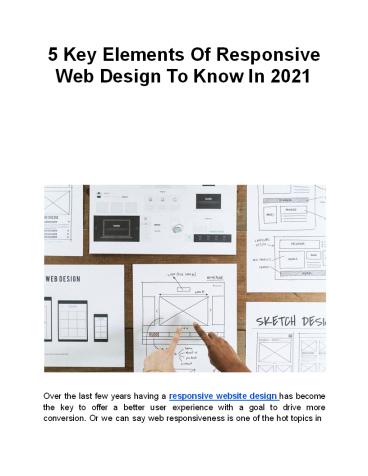
Over the last few years having a responsive
website design has become the key to offer a
better user experience with a goal to drive more
conversion. Or we can say web responsiveness is
one of the hot topics in
2
the website design industry. Most of the websites
have already started to analyze the importance
of creating and offering responsive website
designing and some of them have already faced the
consequence of non-responsive web design. While
there are a lot of tips and tricks available that
can help you to make your website design
responsive. But before that, you need to have a
detailed idea about the five key elements of
responsive web design that you need to look into
when creating a responsive web design for your
business. Knowing about these elements will help
you identify where you need to focus when making
your website design responsive. Or we can say it
will help you to guide on how to get started with
web responsiveness planning. So make sure you
stick to the end of this article to explore some
of the important things that will help you to
make your website design more responsive and
effective. But before they let me offer you a
brief idea about who we are to tell you about
these web responsiveness elements? SFWP Experts
is a highly reputed award-winning wordpress web
design company working with professionals with
more than 10 years of experience in creating
different website designs for different
businesses belonging to various industries. If
you wish to create a highly responsive and
user-centric website design that drives more
traffic and conversion then you can always
consult with our experienced professionals. An
overview of responsive web design elements Like
we have mentioned earlier the popularity of web
design responsiveness is continuously increasing
in the web design industry. Not because
competitors are forcing websites to make the
design responsive but due to the increase in the
number of mobile and tablet users. Most of the
users are diversifying the way they use to access
the internet or the website. Earlier desktops
used to be the primary source of traffic for most
of
3
the websites. But with the increase in the number
of smartphones users have started to access the
internet from their mobile devices. The days are
gone when websites used to focus only on desktop
users, now if you wish to make your website and
product reach the maximum audience then its
essential to make the design responsive. Whether
you call it laziness or addiction, today users
look to find the information or search for any
product on the internet from the nearest device.
And the mobile device is something that is
always present in the users hand. No matter how
effective and helpful information and product
your website is offering to the audience. If
your site visitors are failing to access your
design from mobile devices then they will not
show interest in engaging with the design which
will automatically increase your website bounce
rate. The reason why today most businesses look
to hire experienced wordpress web design
companies for their website and business because
they are aware of the fact every experienced
professional ensures to create a design that
grabs user attention and encourages them to
perform the desired action regardless of the
device website is getting viewed. Remember the
multi-device culture is constantly rising and
widely adopted by different websites and
businesses. If you are failing to make your
design responsive then you might end up losing
prospects searching for your website and the
product/service from their mobile device. Not to
mention, different devices have different screen
sizes and shapes. Mainly when it comes to
smartphones then you may find mobile devices
having different screen sizes like iPhone 12
screen size is different for iPhone 12 pro. In
the same way, a person using a blackberry mobile
will have a different screen shape and size
compared to iPhone users. So to make your
website design reach smartphone users you need to
ensure that the design you are offering is
responsive.
4
But before you start making your web design
responsive you need to be aware of different
elements that help in making your design
responsive. In the coming paragraphs, we will be
offering you a detailed idea about these
elements to make your journey easier and
effective. If you are looking to explore some of
the best award-winning website designs of
different years then make sure to check our
article on 36 Best Award-Winning Website Designs
To Consider in 2021 What is Responsive Website
Design? Before we highlight responsive WordPress
website design tips lets understand the true
meaning of responsive WordPress website design.
It is an approach that makes the web design and
its elements adapt or respond depending on the
size of the screen. If we dive down simpler than
it simply means a responsive WordPress website
automatically detects the resolution of the
device that the browser is using and adjusts all
the content, elements, and visuals or the whole
layouts so that users are able to view every
skill element clearly as they viewed on the
desktop screens. For example, your web page
might contain elements split into different
columns into the desktop devices or screens
because there you get full freedom to play with
the design and use maximum space to highlight
important elements. But when it comes to mobile
devices, the view wont be able to interact and
engage with the element or content separated into
columns. The responsiveness of the WordPress
website design makes it possible for the user to
access the element regardless of the devices and
screen it is getting viewed on. The main goal
behind making a WordPress website design
responsive is to offer a consistent user
experience by allowing users to easily maximize,
minimize, and scroll the WordPress website along
with smooth navigation and all the elements
accessible through their fingertips.
5
By now you must have a clear idea about what a
responsive WordPress website design is? Next,
lets take a look into why its essential for
WordPress websites and businesses to have a
responsive WordPress website design? Why do
businesses need to look at elements of
responsive web design? Having a responsive web
design is not anymore considered a feature but it
has become essential for every business to offer
a responsive web design to their prospects.
Mainly when you are looking to outperform your
existing customer with a goal to drive more
traffic and conversion on the website. Before
you start to make your web design responsive its
essential to have a detailed idea about the
elements of responsive web design. It will help
you to analyze where you need to start when
making your web design responsive. You might be
offering a helpful product/service to your
prospects but if they are failing to access your
design for the mobile or tablet device then all
your efforts in creating the product/services
can go in vain. The same goes with the visual
and design you are creating and offering to your
site visitors. Today the internet has helped
many businesses to reach out to the maximum
number of audiences but to ensure that users are
able to interact with your website and business
you need to make your website responsive. Mainly
with the increase in the number of smartphones
and mobile users if you are ignoring to make
your website design responsive then it will
directly impact your business revenue. On the
other hand, if you are able to create and offer
a responsive website design then you will be able
to create a great user experience that will
result in better conversion and business
reputation. So before we start highlighting some
of the important elements of responsive web
design, lets take a look at what you need to
make your website design responsive.
6
1. Increase in the mobile usage As we have
mentioned earlier, web responsiveness has become
the key factor that helps websites and
businesses to drive maximum traffic and
conversion on the website. And if your wonder why
you need to make your website design responsive
then the answer is very simple Mobile devices
and users are continuously increasing. Today
nearly 58 of American adult-use smartphones and
nearly 55 of the traffic is generated from
mobile devices. Many states claim soon mobile
devices will be the primary source to drive
organic and paid traffic. If you are failing to
make your website mobile responsive then you are
losing your prospects to competitors that are
running responsive website design for their
business. Instead of losing your prospects to
your competitors website you can hire an
experienced website design company that can help
you to make your design responsive. By hiring
experienced professionals for your website you
ensure that users lying on your website do not
come across any issues or difficulties while
interacting with the web design on any
device. Read More 5 Key Elements Of Responsive
Web Design To Know In 2021 Contact
Details 213-277-9177 la_at_sfwpexperts.com Web
design Los Angeles
7
Read More Blogs How To Make WordPress Websites
Mobile-Friendly? (8 Proven Tips To Follow In
2021) 8 Ways To Create Responsive Web Design For
The Business In 2021
Recommended
