3' Describing a Sample PowerPoint PPT Presentation
1 / 8
Title: 3' Describing a Sample
1
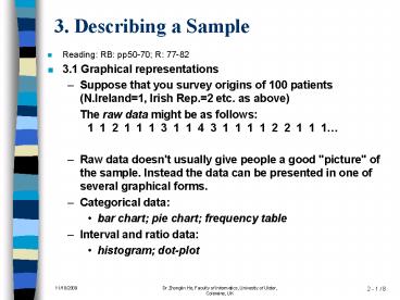
3. Describing a Sample
- Reading RB pp50-70 R 77-82
- 3.1 Graphical representations
- Suppose that you survey origins of 100 patients
(N.Ireland1, Irish Rep.2 etc. as above) - The raw data might be as follows 1 1 2 1 1
1 3 1 1 4 3 1 1 1 1 2 2 1 1 1 - Raw data doesn't usually give people a good
"picture" of the sample. Instead the data can be
presented in one of several graphical forms. - Categorical data
- bar chart pie chart frequency table
- Interval and ratio data
- histogram dot-plot
2
3.1 Graphical representations
- In the examples below suppose that there were 128
in the sample and of these 42 patients were from
N. Ireland, 30 from Irish Rep., 22 from Britain,
8 from the EC and 26 from non-EC countries. - Bar chart
- the categories are listed along the bottom and
the height of each bar represents the number in
that category
3
3.1 Graphical representations
- Pie chart
- Disc is divided between categories, size of slice
represents number in category - Note there are 360o in a circle. To calculate
the angle for e.g. N.Ireland, you multiply 360 by
the fraction of the sample that were from N.
Ireland (Angle(NI) 3600 (42 / 128) 1180)
4
3.1 Graphical representations
- Frequency Table (also called a tabulation)
(Tally) - Simply a table giving the frequency (i.e. how
many were in that category) and, if desired, the
percentage.
5
3.1 Graphical representations
- Histogram
- If dealing with continuous data, we break the
data into classes (i.e. ranges or intervals). For
example, if you survey ages of 160 patients, we
might break the data into classes - 18-22
- 22-26
- 26-30
- 30-34
- 34-38
- 38-42
- 42-46
- Height of each bar represents number in each
interval. Centre the bar on the midpoint of the
interval. Class boundaries are at the sides of
bars
6
3.1 Graphical representations
- Dot Plot
- A dot-plot is similar to a histogram except the
bar is made of dots. Number of dots number of
data of that value. - It is easier to show a larger number of intervals
or even a continuous range of whole numbers with
a dot plot, e.g. the following dot plots show
data for heart rate (beats per minute). - ------------------------ beats
- 68 74 80 86 92
7
3.2 Shapes of the graph
- If we drew a histogram for a population using
very small intervals we would get something like
a line graph. - The shape of a graph can be symmetric and
bell-shaped. Often a graph is skewed. Less
commonly a graph may be not bell-shaped but
instead have several "humps". - A graph representing length of stay in hospital
for women giving birth is skewed to the right - A graph representing weight of patients in a
special clinic for eating disorders can be
bell-shaped
8
3.2 Shapes of the graph
- The symmetric bell-shape is very common and so
populations with such a graph are said to be from
a Normal or Gaussian distribution, e.g. the
number of arrivals at casualty in any day might
be described as from a normal distribution since
it would be bell-shaped and (reasonably)
symmetric. - Of course if a sample is big enough, its graph
will be the same shape as the (underlying)
population and so a sample might be described as
being normal. - Some statistical tests can only be used if the
population is known (or can be assumed) to be
normal.

