
Responsive Web Design Services PowerPoint PPT Presentation
Title: Responsive Web Design Services
1
(No Transcript)
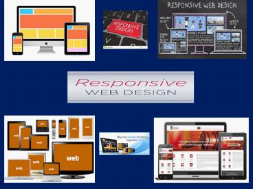
2
What is Responsive Web Design?
- Responsive Web Design (RWD) is an approach of
laying-out and coding a website such that the
website provides an optimal viewing experience -
ease of reading and navigation with a minimum of
resizing, panning, and scrolling -across a wide
range of devices
3
- Smartphone's and tablets have changed the
approach toward design and user experience.
Before the proliferation of mobile devices with
advanced web-browsing capability , web designers
had only one primary challenge to deal with
keeping the same look and feel of their websites
in various desktop computer browsers.
4
- However, interacting with websites on smart
phones and tablets is not the same as doing that
on a desktop computer monitors. Factors such as
Click versus Touch, Screen-size,
Pixel-resolution, support for Adobes Flash
technology, optimized markup and many more have
become crucial while creating websites with
Responsive Design
5
- But, why is responsive design so important for
your website? Before we understand that, we must
understand what is Responsive Web Design.
6
Benefit
- Future proofing. Responsive sites work well
across the multitude of existing devices on the
market. Its a safe bet it will for considerable
time to come. - Better, faster, smarter user experience. Optimizin
g your site no matter what the user chooses to
view it on makes their life easier. Happier
customers means a happier business. - Cost Effective. Responsive sites take a little
longer to put together, but they survive longer
and the unified approach means management,
support and upgrades only need be applied to one
place. That saves time and money.
7
Benefit
- SEO optimized. Managing SEO Services for separate
mobile and desktop sites is hard and doesnt
produce great results. Google actually recommends
a responsive approach to combat these problems
and a consolidated view of your results means
more focus. - Improve conversion rates. An optimized and
consistent site, no matter what platform its
viewed on, provides a better experience for the
user which is more likely to lead to them
engaging with you than going elsewhere
8
- For more information visit
- http//refine-interactive.com
Recommended
