Principles of effective web designs - PowerPoint PPT Presentation
Title:
Principles of effective web designs
Description:
Having a user-centric website design that caters to the consumers’ needs and requirements can be considered as the best and successful web design. – PowerPoint PPT presentation
Number of Views:34
Title: Principles of effective web designs
1
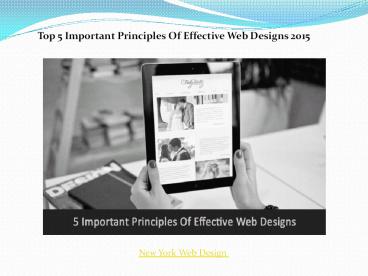
Top 5 Important Principles Of Effective Web
Designs 2015
New York Web Design
2
- How a website looks is undoubtedly important,
but another aspect that is equally or many times
more important is the usability of the website.
However good or attractive a website might look,
if it is difficult and time-consuming to use,
then the users might get distracted, thus
reducing the popularity of the brand. Having a
user-centric website design that caters to the
consumers needs and requirements can be
considered as the best and successful web design.
We offer some detailed insight on some of the
important principles of a successful and
effective web design that every designer and
brand should know.
New York Web Design
3
- 1. Answer all the basic questions that a consumer
would think of - A website should be informational, and
should offer all the important insights a
consumer would need when he/she is busy browsing
it. That does not mean you need to dump in a huge
proportion of content that the consumers would
get bored or confused of. Keep it simple and to
the point, and easy to locate. Ensure that the
content of the website does not lead to more
doubts or queries for the consumers, as well as
offers fast and easy solution to the consumers
queries.
New York Web Design
4
- 2. Ensure the website does not test a consumers
patience - If your website requires consumer engagements
via a tool or service, make sure you include
minimalistic requirement details. For instance,
if it is a registration tool or a form that is
necessary before the consumer makes the purchase,
then ensure the details arent too tiring or
boring for the consumers to fill in. Also, make
sure that the website is easy to load, as
consumers might get easily bored or stressed out
if they have to wait for a long time for the
desired page to open.
New York Web Design
5
- 3. Maintain users attention
- Websites these days are designed in a manner
that they attract the users attention in less
time. Be if using images, videos or unique
graphics, ensure the website is eye-catchy and
catches the users attention immediately. While
doing so, take care that the website design does
not look gaudy, and bright. Let it be subtle yet
attention-grabbing. Do not make use of high
proportion content, as it might be boring for the
consumers to read the entire page. Let the
content speak less, but focus on the direct
message that the product or brand wants to convey.
New York Web Design
6
- 4. A good content is essential
- Dont hit around the bush while trying to be
creative and elaborate. Short and simple content
conveys a lot, and is preferred by consumers. Get
straight to the point and let the content be bold
and specific. - 5. Keep adequate white space
- White space is essential for a website to look
professional and attractive. Most people prefer
not to keep much of white space, as they think it
makes the website look simple and unattractive.
However, white space these days offers a perfect
layout that differentiates important and good
piece of information.
New York Web Design
7
Contact Us
- Address 501-3292 Production Way, Burnaby, BC
Canada - Pin code V5A4R4
- Phone no 1-888-936-3653
- Email info_at_wittycookie.com
- Website http//www.wittycookie.com
8
New York Web Design


