5 Steps to Banner Design Success PowerPoint PPT Presentation
Title: 5 Steps to Banner Design Success
1
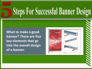
What to make a good banner? There are five key
elements that go into the overall design of a
banner.
2
Material
Banner material falls into three general
categories Lightweight These banners are
generally 10 ounces and are great for indoors and
short-term outdoor purpose. These are great for
birthday parties, office celebrations and the
like. Standard These banners are generally
around 13 ounces and are perfect for outdoors.
Heavyweight This banner is 17 ounces and above.
This is really only needed for extreme outdoor
conditions and is generally not need for any
other purpose.
3
Size
The banner is essential to be designed as per its
utility. The size and the design must be accurate
for viewing it from a distance while judging the
place of installation. For instance A small
sized or a tiny banner outside a tall building
remains unnoticed until you stand next to it and
the contrary of it is also not admirable. So, a
banner shall be used according to the
surroundings and not as a wallpaper.
4
Fonts
The fonts that you use are critically important.
Your font should be readable yet consistent with
your brand image. The absolute worst thing you
can do is to use a script font and use all
capital letters.
5
Contrast
Good colour contrast between your banners text
and background is critical for running a
successful banner ad. Without enough contrast,
your text will be difficult to read and users
will be less likely to click on your ad.
Conversely, too much contrast can cause eye
strain.
6
Graphics
Gone are the days when using text on a banner was
enough. Today, near photo quality graphics are in
vogue. There are a lot of resources for full
colour photos, banner printings while using
graphics. Numerous options help you get the
visually stunning banners. Though, the
professional banner making companies have a lot
of tools and tacts of designing the best
banners, but make sure you provide the sufficient
pixels if you want to use your own photographs in
the banners.
7
Contact Us
Display Systems Australia Address Discovery
Cove Industrial Park Unit 19, 1801 Botany Road,
Banksmeadow NSW 2019 Phone (02) 9663 5333
Email info_at_displaysystems.net.au Website
displaysystems.net.au
PowerShow.com is a leading presentation sharing website. It has millions of presentations already uploaded and available with 1,000s more being uploaded by its users every day. Whatever your area of interest, here you’ll be able to find and view presentations you’ll love and possibly download. And, best of all, it is completely free and easy to use.
You might even have a presentation you’d like to share with others. If so, just upload it to PowerShow.com. We’ll convert it to an HTML5 slideshow that includes all the media types you’ve already added: audio, video, music, pictures, animations and transition effects. Then you can share it with your target audience as well as PowerShow.com’s millions of monthly visitors. And, again, it’s all free.
About the Developers
PowerShow.com is brought to you by CrystalGraphics, the award-winning developer and market-leading publisher of rich-media enhancement products for presentations. Our product offerings include millions of PowerPoint templates, diagrams, animated 3D characters and more.

