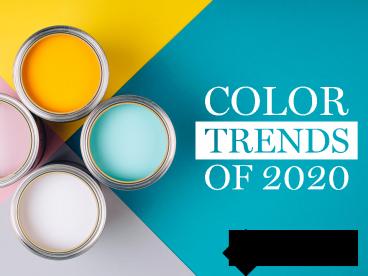
Color Trends of 2020 - PowerPoint PPT Presentation
Title:
Color Trends of 2020
Description:
| Whatever your design plans are for 2020, adding some color to your space is a great way to add some instant impact. Whether it is a pop of blue, dash of coral, glint of green or a warm coffee, you can create a space that is uniquely your own. Learn about the color trends of 2020. – PowerPoint PPT presentation
Number of Views:49
Title: Color Trends of 2020
1
(No Transcript)
2
- It seems like everywhere you look gray is the
go-to color. A simple scan of Pinterest or
Instagram shows beautiful rooms in subtle shades
of dove, owl, pewter, or silver. While a neutral
room is a great base to work from, it can often
feel cookie cutter, basic or just plain boring.
This year, designers everywhere are embracing
color again. In order to give your home the
latest look consider these trends.
3
- Like a little black dress, navy is a design
classic. Bright blue hues will pop against your
neutral gray walls, and subtle, softer shades of
sky will add tranquility to your bathroom or
bedroom. Dress up your living room by adding some
decorative toss pillows, some ceramic lamps, and
a cashmere throw in a cerulean blue. Give your
dining room an instant update by painting it a
rich Hale Navy from Benjamin Moore. Infuse some
color into your bathroom by adding a frame from
MirrorMate Frames to your builders grade mirror
in a gorgeous Deep Blue Sea or Aegean Blue hue
from their Ocean Collection.
4
- Think of coral as last years millennial pink all
grown up. Bolder and more saturated, coral
complements brighter, richer shades of blue and
pairs nicely with turquoise tones. Consider
re-covering a favorite accent chair in this
luscious shade to perk up a dull, drab space.
Paint a headboard or a dresser a sunny shade of
coral to add some fun to a guest room. Benjamin
Moores Coral Gables is sure to make your space
pop while its Sunlit Coral will add some subtle
color to your space.
5
Call it what you wantemerald, kelly, grassy or
citrinegreen is a go-to color for any room. Just
like a neutral, green has a way of grounding and
balancing a space. Breathe life into your kitchen
by painting your cabinets Tea Light from Benjamin
Moore. This color works equally well with white,
espresso or brown tones and is a happy retreat
from a builders basic color. Add tranquility to
your bathroom or bedroom by choosing new linens
in a coastal-inspired shade like
Sherwin-Williams Sea Salt. This color pairs well
with on-trend neutrals and is more modern leaning
than the sage shades of the 1990s. Add a touch of
whimsy to your bath or powder room by painting a
paintable MirrorMate Frame a bold pop of color
such as Sherwin-Williams Greenbelt.
6
- For some, committing to a color can be scary. For
others, they prefer a neutral color palette.
Break away from the cooler grays and add some
warmth to your space with some sandier hues.
Sophisticated shades such as Sherwin-Williams
Latte pair beautifully with linen and ivory
tones. Warm colors such as Benjamin Moores
Seattle Mist work well with the new bleached wood
and reclaimed flooring options that are becoming
more and more popular.
7
- Whatever your design plans are for 2020, adding
some color to your space is a great way to add
some instant impact. Whether it is a pop of blue,
dash of coral, glint of green or a warm coffee,
you can create a space that is uniquely your own.


