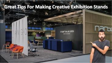
Great Tips For Making Creative Exhibition Stands - PowerPoint PPT Presentation
Title:
Great Tips For Making Creative Exhibition Stands
Description:
Your exhibition display is the face of your company at the exhibition show. – PowerPoint PPT presentation
Number of Views:5
Title: Great Tips For Making Creative Exhibition Stands
1
Great Tips For Making Creative Exhibition Stands
2
TABLE OF CONTENTS
- Look High
- Look Low
- Target Audience
- Dont Overdo The Text
- Let There Be Light
3
LOOK HIGH
Its amazing how often this can be overlooked! A
good design maximizes all of the available stand
space, including the area above it. Paying
attention to this space is critical and can
really help an exhibition stand pop-out and get
seen from a distance. If the space is available
to be used, use it!
4
LOOK LOW
Another area that often seems to be an
afterthought, paying attention to your stands
flooring can really make a huge difference. The
right flooring can help a brand design flow,
define the stand as a space within the hall and
be played around with to create unique features.
5
TARGET AUDIENCE
Tailoring your stand design to your target
audience is not always as simple as it sounds. If
for example your primary aim is to present a
range of products to potential customers, you
would want to pay careful attention to display
cabinets, shelving, lighting, and leaving enough
room for customers to browse.
6
DONT OVERDO THE TEXT
When youre trying to tell potential clients
about your services it can be tempting to put as
much information as possible into your stand
design, but this is often a mistake. When it
comes to text on a stand design, less is always
more. In general, make the text short and snappy.
Bold statements with the key information you want
to present to attendees work well as a feature of
the design and keep their attention better than
long lists of services you provide.
7
LET THERE BE LIGHT
Lighting is one of the main components that can
really make a stand pop. Incorporating the
lighting into the lines of the design and key
stand-out areas can help to create a bright stand
with a stylish and modern finish.
8
WOW SPACE CREATIVE EXHIBITIONS
Wow-Space is a full-service Custom Build and
Modular exhibition stand design and build company.
08000314938
www.wow-space.co.uk
Be the first to comment on this presentation.


![NOTE: To appreciate this presentation [and ensure that it is not a mess], you need Microsoft fonts: PowerPoint PPT Presentation](https://s3.amazonaws.com/images.powershow.com/6427398.th0.jpg?_=20200728051)


![NOTE: To appreciate this presentation [and insure that it is not a mess], you need Microsoft fonts: PowerPoint PPT Presentation](https://s3.amazonaws.com/images.powershow.com/5430111.th0.jpg?_=20200818126)


