
What Are The Three Components Of Responsive Web Design With Examples? PowerPoint PPT Presentation
Title: What Are The Three Components Of Responsive Web Design With Examples?
1
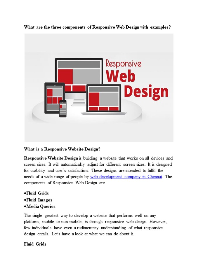
What are the three components of Responsive Web
Design with examples?
- What is a Responsive Website Design?
- Responsive Website Design is building a website
that works on all devices and screen sizes. It
will automatically adjust for different screen
sizes. It is designed for usability and users
satisfaction. These designs are intended to
fulfil the needs of a wide range of people by web
development company in Chennai. The components of
Responsive Web Design are - Fluid Grids
- Fluid Images
- Media Queries
- The single greatest way to develop a website that
performs well on any platform, mobile or
non-mobile, is through responsive web design.
However, few individuals have even a rudimentary
understanding of what responsive design entails.
Let's have a look at what we can do about it. - Fluid Grids
2
The paper size was your defining trait in terms
of layout when you ran a magazine, newspaper, or
other print media. You couldn't fit more than
10.5 inches of text on a typical piece of paper,
no matter what additional tactics you used. For a
long time, everyone viewed web pages in the same
way you have the width of your screen and the
length of...until you run out of options. The
width of your screen, on the other hand, isn't
constant. I can flip from my iPod, iPad, laptop,
and desktop screens, and I frequently browse the
same website on multiple devices at the same
time. Instead of static numbers of pixels,
responsive websites use elements that are defined
as percentages of the screen's width. (To be more
precise, elements are formed with elements
defined as percentages of the wrapper that
specifies the website's edges, which aren't
always the same as the screen's edge, but that's
a technical remark.) Fluid Images Similarly, the
responsive design employs CSS to specify pictures
that have a maximum size (to avoid being
stretched or pixelated) but no minimum size (to
allow them to shrink proportionally to fit inside
the context of the content they're a part of).
Because CSS keeps the aspect ratio constant,
there should be no pixelation. Media
Queries Media queries are the undisputed king of
responsive design. For years, CSS has used media
queries, which essentially tell a CSS style sheet
to "ask the browser a query and only do X if you
get Y as a response." CSS can, for example, ask a
browser, "What width is your frame now set to? If
the response is "gt400 pixels," CSS will generate
a two-column page if the response is "400
pixels," CSS will create a single, much longer
column. Even the most flowing grid has
'breakpoints' where it does not look nice. When
the website reaches such points, media queries
allow it to re-define itself on the fly, allowing
new elements to appear while keeping the page as
pleasing to the eye and as functional as the
screen size allows. Design the Mobile Site First
3
The greatest advice from web designing company in
Chennai is to build your mobile site first, then
add elements so that it naturally 'grows' into a
mobile site. The rationale for this is simple
because a mobile site can only include a limited
number of elements. It compels you to concentrate
your efforts on the features that your audience
will find most appealing. It means that your
desktop site will be unable to lose those core
pieces, and the extra information that appears
around them will also be core-centric. These
three elements, when paired with a current
thought process, are used to create sites that
are adaptable and don't have any preconceived
notions about the resolution of a
screen. Although responsive web design is still a
new concept, it offers several benefits to users,
including the ability to browse a single site
from many devices. The ability to work across
various devices provides consumers with a
consistent experience without the need for a
separate mobile site, which is a big benefit for
any website. This presents new issues for
designers. According to recent research, testing
web designs across numerous devices is a common
issue for web designers. This can be a problem if
a designer does not have direct access to all of
the devices that are regularly used to access the
internet. Smaller design firms may find it costly
to evaluate if their site operates effectively
across multiple platforms because mobile devices
are always changing. Device sharing is one
option, which has gained traction in some design
circles but is still uncommon. There are some
mobile emulators and site validators available,
but you may need more than one to test all types
of devices. Demonstrate Responsive Design To Your
Clients Instead of explaining the responsive
design to your clients, show them what it looks
like. This will have a greater impact on them
than explaining it to them in technical jargon
that they may not comprehend. Although media
queries and fluid grids are standard words for
web designers, most of your clients will not
comprehend them.
4
Begin by displaying a site on a variety of
devices. Demonstrate how wireframes and sketches
may be extremely useful tools. Remember that you
won't have any pixel-perfect visual designs to
show them until their site is finished. This was
a lot easier for them to grasp, but you still
need to show them how RWD will make their site
more usable. Some designers believe that
responsive design is the only method to construct
new websites since it allows them to react to
their client's requests and accommodates the
swipe and touch functionalities found on most
mobile devices. Overcoming RWD Issues There are
challenges with RWD, like with other new
technologies however, most of them have been
resolved without too many hassles. To begin with,
some designers encountered issues with pictures,
navigation, and tables. However, these issues
were overcome by combining SVG, icon fonts, and
scripts with a uniform design. There are extra
challenges for pre-existing sites that are built
on a predetermined width. Other challenges arise
as a result of the significant differences
between traditional and responsive design. When
faced with an issue like this, a designer has two
options Reverse the site's design This isn't
always the greatest solution, and it takes a lot
longer than recreating a site. However, due to a
variety of variables, this may be the only option
available at times. Rebuild the site It is often
faster and less expensive to create whole new
style sheets and templates. The designer will be
able to construct a more responsive device and
organize the information correctly as a result of
this. When a site visitor is using an older type
of browser, another difficulty with responsive
design arises. As a result, the site may appear
to be too small for the viewer's browser window.
Filler can be used to solve this issue. Is
Responsive Web Design Right for You? If you don't
use RWD, you can be limiting your audience's
viewing options. This will not be useful to your
company. Because individuals use a wide range
5
of browsers and devices to access the internet,
sites that can engage with all of them will have
better metrics. This will result in more site
visitors converting to leads or paying customers,
which is usually why businesses have a website in
the first place! People are increasingly using
their mobile devices as their sole means of
accessing the internet. They are not using their
laptops or desktops at all. As a result, not
having a responsive site will make things tough
for consumers on the go, therefore eliminating a
significant segment of your potential
clients. Responsive design will be here for the
foreseeable future, thanks to the fast- expanding
options for viewing the web and their
ever-increasing availability. RWD may become the
only option to build a high-quality,
user-friendly website.
Recommended
