The Three Main Goals of Data Visualization - PowerPoint PPT Presentation
Title:
The Three Main Goals of Data Visualization
Description:
Data visualization serves three primary goals: to enhance understanding, support decision-making, and communicate insights effectively. Firstly, it transforms complex datasets into intuitive visual formats, enabling stakeholders to grasp trends and patterns quickly. Secondly, by distilling vast amounts of information, it aids in informed decision-making, allowing organizations to respond swiftly to emerging challenges and opportunities. Lastly, effective data visualization facilitates communication by presenting insights in a clear and engaging manner, making it easier for diverse audiences to interpret and act upon the data. Collectively, these goals underscore the integral role of data visualization in today’s data-driven landscape. – PowerPoint PPT presentation
Number of Views:0
Date added: 12 November 2024
Slides: 3
Provided by:
visualsculptors
Category:
How To, Education & Training
Tags:
Title: The Three Main Goals of Data Visualization
1
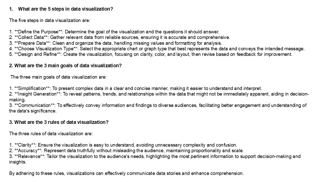
- What are the 5 steps in data visualization?
- The five steps in data visualization are
- 1. Define the Purpose Determine the goal of
the visualization and the questions it should
answer. - 2. Collect Data Gather relevant data from
reliable sources, ensuring it is accurate and
comprehensive. - 3. Prepare Data Clean and organize the data,
handling missing values and formatting for
analysis. - 4. Choose Visualization Type Select the
appropriate chart or graph type that best
represents the data and conveys the intended
message. - 5. Design and Refine Create the
visualization, focusing on clarity, color, and
layout, then revise based on feedback for
improvement. - 2. What are the 3 main goals of data
visualization? - The three main goals of data visualization are
- 1. Simplification To present complex data in
a clear and concise manner, making it easier to
understand and interpret. - 2. Insight Generation To reveal patterns,
trends, and relationships within the data that
might not be immediately apparent, aiding in
decision-making. - 3. Communication To effectively convey
information and findings to diverse audiences,
facilitating better engagement and understanding
of the data's significance. - 3. What are the 3 rules of data visualization?
2
4. What are data stories? Data stories are
narratives that combine data analysis with
storytelling techniques to communicate insights
effectively. They use visualizations, context,
and relatable anecdotes to make complex data more
accessible and engaging for audiences. By
structuring data in a compelling way, data
stories emphasize key findings, highlight trends,
and illustrate the implications of the data. This
approach not only aids in understanding but also
helps persuade and inform decision-making by
connecting data to real-world scenarios and human
experiences. Ultimately, data stories bridge the
gap between raw data and audience
comprehension. 5. How do you explain data
visualization? Data visualization is the
graphical representation of information and data.
By using visual elements like charts, graphs, and
maps, it helps to simplify complex data sets,
making patterns, trends, and correlations easier
to understand. Effective data visualization
enhances comprehension, enabling quick insights
and informed decision-making. It turns raw data
into a visual context, allowing audiences to
grasp difficult concepts and identify new
opportunities or issues briefly. Ultimately, it
serves as a powerful tool for communication,
facilitating better storytelling with
data. Visit VS Website See more Blog


