Essential Setup Steps for Optimal Data Visualization in Adobe Analytics PowerPoint PPT Presentation
Title: Essential Setup Steps for Optimal Data Visualization in Adobe Analytics
1
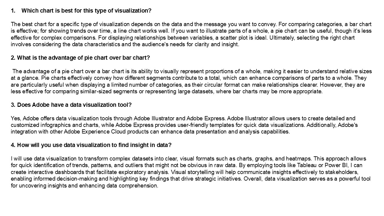
- Which chart is best for this type of
visualization? - The best chart for a specific type of
visualization depends on the data and the message
you want to convey. For comparing categories, a
bar chart is effective for showing trends over
time, a line chart works well. If you want to
illustrate parts of a whole, a pie chart can be
useful, though it's less effective for complex
comparisons. For displaying relationships between
variables, a scatter plot is ideal. Ultimately,
selecting the right chart involves considering
the data characteristics and the audience's needs
for clarity and insight. - 2. What is the advantage of pie chart over bar
chart? - The advantage of a pie chart over a bar chart is
its ability to visually represent proportions of
a whole, making it easier to understand relative
sizes at a glance. Pie charts effectively convey
how different segments contribute to a total,
which can enhance comparisons of parts to a
whole. They are particularly useful when
displaying a limited number of categories, as
their circular format can make relationships
clearer. However, they are less effective for
comparing similar-sized segments or representing
large datasets, where bar charts may be more
appropriate. - 3. Does Adobe have a data visualization tool?
- Yes, Adobe offers data visualization tools
through Adobe Illustrator and Adobe Express.
Adobe Illustrator allows users to create detailed
and customized infographics and charts, while
Adobe Express provides user-friendly templates
for quick data visualizations. Additionally,
Adobe's integration with other Adobe Experience
Cloud products can enhance data presentation and
analysis capabilities. - 4. How will you use data visualization to find
insight in data? - I will use data visualization to transform
complex datasets into clear, visual formats such
as charts, graphs, and heatmaps. This approach
allows for quick identification of trends,
patterns, and outliers that might not be obvious
in raw data. By employing tools like Tableau or
Power BI, I can create interactive dashboards
that facilitate exploratory analysis. Visual
storytelling will help communicate insights
effectively to stakeholders, enabling informed
decision-making and highlighting key findings
that drive strategic initiatives. Overall, data
visualization serves as a powerful tool for
uncovering insights and enhancing data
comprehension.
2
5. How do I enable Adobe Analytics? To enable
Adobe Analytics, follow these steps 1. Sign in
to your Adobe Experience Cloud account. 2.
Navigate to the Admin Console and select
"Analytics." 3. Create a new report suite or
select an existing one. 4. Configure your
settings, including data collection preferences
and user permissions. 5. Implement the Adobe
Analytics tracking code (AppMeasurement.js) on
your website or app. 6. Test the implementation
using tools like Adobe Debugger or browser
console. 7. Once confirmed, start collecting and
analyzing data in your Adobe Analytics dashboard.
Ensure you have the necessary permissions and
licenses for your organization. V
isit VS Website See more Blog

