
A Comprehensive Overview of Column Chart Design and Animation Techniques PowerPoint PPT Presentation
Title: A Comprehensive Overview of Column Chart Design and Animation Techniques
1
Data Visualization Charts, Graphs and
Infographic designs MS Graph Top Questions
Answered
1.How do I edit a column chart in PowerPoint?
To edit a column chart in PowerPoint, first
click on the chart to select it. Then, use the
Chart Tools that appear in the ribbon. Under the
"Design" tab, you can change the chart style or
data. To modify data, click "Edit Data" to open
an Excel-like spreadsheet. Here, you can adjust
the values or categories. For formatting,
right-click on specific chart elements (like bars
or axes) to access options such as colors,
labels, and styles. After making changes, click
outside the chart to save your edits.
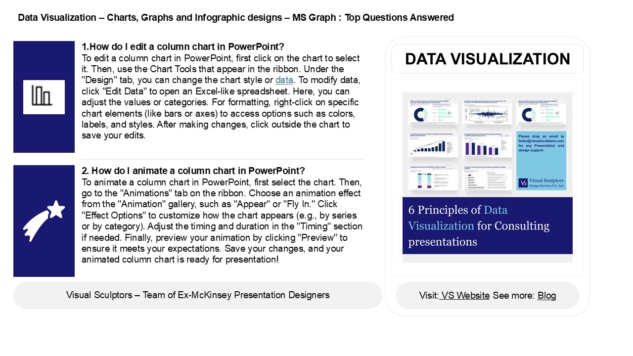
DATA VISUALIZATION
2. How do I animate a column chart in PowerPoint?
To animate a column chart in PowerPoint, first
select the chart. Then, go to the "Animations"
tab on the ribbon. Choose an animation effect
from the "Animation" gallery, such as "Appear" or
"Fly In." Click "Effect Options" to customize how
the chart appears (e.g., by series or by
category). Adjust the timing and duration in the
"Timing" section if needed. Finally, preview your
animation by clicking "Preview" to ensure it
meets your expectations. Save your changes, and
your animated column chart is ready for
presentation!
2
Data Visualization Charts, Graphs and
Infographic designs MS Graph Top Questions
Answered
3. How do I make columns in Google PowerPoint?
To create columns in Google Slides (PowerPoint
equivalent), use a text box. Insert a text box by
clicking "Text box" from the toolbar. Then, type
your text and manually format it into columns by
using the "Format options" or by adjusting the
text box size. Alternatively, you can use tables
by inserting a table from the "Insert" menu.
4. What is column chart in PowerPoint? A
column chart in PowerPoint is a type of graph
that displays data using vertical bars. Each bar
represents a category of data, with the height
indicating the value. It's useful for comparing
different groups or showing changes over time.
You can customize the chart's colors, labels, and
style to enhance visual appeal and clarity.
5. How do I sort a column chart in PowerPoint?
To sort a column chart in PowerPoint, right-click
on the chart and select Edit Data. In the Excel
sheet that opens, sort the data by selecting the
relevant column and using the sort options
(ascending or descending) in Excel. The chart
will automatically update to reflect the sorted
data. Close the Excel sheet when done.
Recommended
