
Enhancing Your Presentations: Crafting Attractive Charts in PowerPoint PowerPoint PPT Presentation
Title: Enhancing Your Presentations: Crafting Attractive Charts in PowerPoint
1
Data Visualization Charts, Graphs and
Infographic designs - MS Graph Top Questions
Answered
- 1.How do I make a bar chart look good in
PowerPoint? - To create an appealing bar chart in PowerPoint,
start by choosing a clean, professional design.
Use a consistent color scheme that aligns with
your presentations theme. Limit the number of
bars to avoid clutter focus on key data. Adjust
the axis labels for clarity and ensure they are
legible. Incorporate data labels for easy
reference. Utilize white space effectively, and
consider adding a title that summarizes the
charts purpose. Finally, practice your
presentation to ensure the chart complements your
narrative seamlessly.
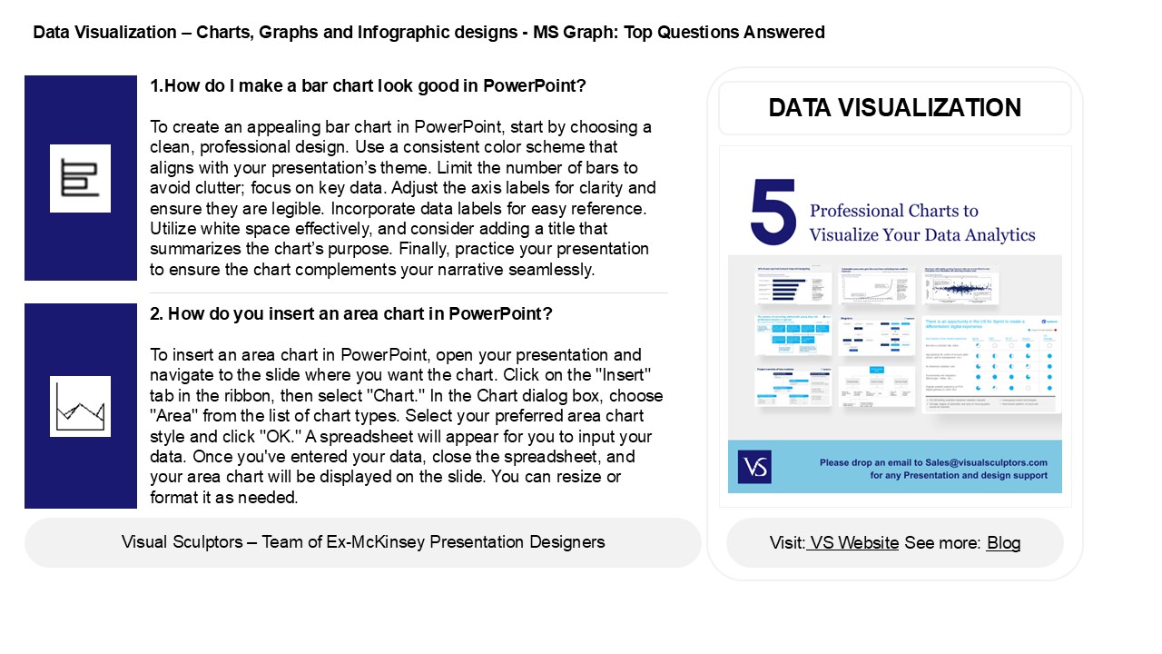
DATA VISUALIZATION
2. How do you insert an area chart in PowerPoint?
To insert an area chart in PowerPoint, open
your presentation and navigate to the slide where
you want the chart. Click on the "Insert" tab in
the ribbon, then select "Chart." In the Chart
dialog box, choose "Area" from the list of chart
types. Select your preferred area chart style and
click "OK." A spreadsheet will appear for you to
input your data. Once you've entered your data,
close the spreadsheet, and your area chart will
be displayed on the slide. You can resize or
format it as needed.
2
Data Visualization Charts, Graphs and
Infographic designs - MS Graph Top Questions
Answered
3. How do I increase the area of a chart in
PowerPoint? To increase the area of a chart in
PowerPoint, click on the chart to select it.
Then, drag the corners or edges of the chart to
resize it. For more precise adjustments,
right-click the chart, select "Format Chart
Area," and modify the size settings under the
"Size Properties" tab. Additionally, you can
adjust the layout by clicking on "Chart Design"
and selecting "Change Chart Type" or using the
"Design" tab to change the chart's overall style,
which can also help optimize the area used.
4. How do you remove the chart area in
PowerPoint? To remove the chart area in
PowerPoint, click on the chart to select it.
Then, right-click on the chart area (the outer
part of the chart) and choose "Format Chart Area"
from the context menu. In the Format Chart Area
pane, select "Fill" and choose "No fill" to make
the chart area transparent. Alternatively, you
can delete the entire chart by selecting it and
pressing the "Delete" key on your keyboard if you
want to remove it completely.
5. How do you format the chart area in
PowerPoint? To format the chart area in
PowerPoint, right-click on the chart and select
"Format Chart Area." In the sidebar that appears,
you can adjust options such as fill color, border
color, and shadow effects. You can also change
the transparency and apply different styles.
Additionally, you can access formatting tools
from the "Chart Design" and "Format" tabs in the
Ribbon, allowing for further customization of
elements like data labels, axes, and legends.
Remember to preview changes to see how they
affect the overall presentation.
Recommended
