
Enhancing Your Presentations: The Benefits of Scatter Charts in PowerPoint PowerPoint PPT Presentation
Title: Enhancing Your Presentations: The Benefits of Scatter Charts in PowerPoint
1
Data Visualization Charts, Graphs and
Infographic designs - MS Graph Q A Tutorial
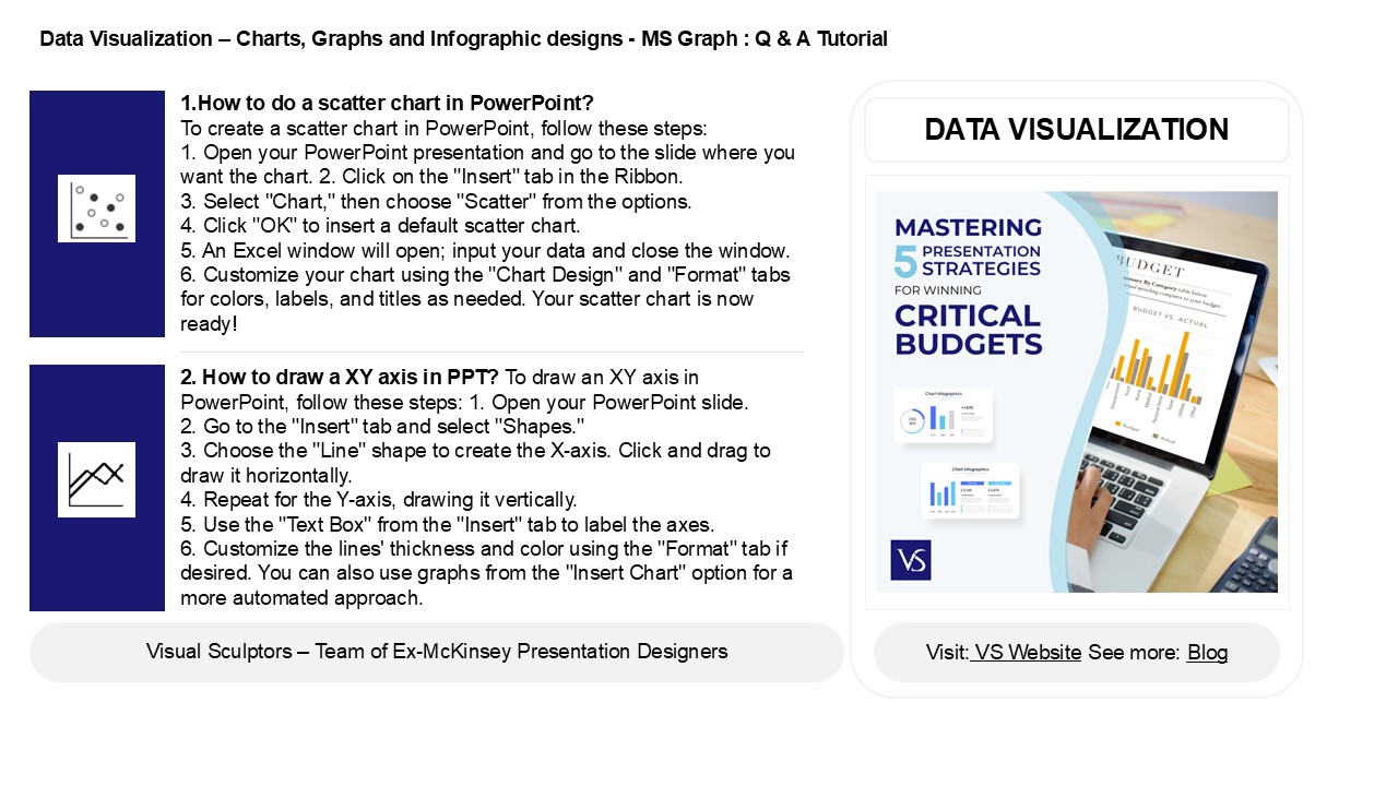
1.How to do a scatter chart in PowerPoint? To
create a scatter chart in PowerPoint, follow
these steps 1. Open your PowerPoint
presentation and go to the slide where you want
the chart. 2. Click on the "Insert" tab in the
Ribbon. 3. Select "Chart," then choose "Scatter"
from the options. 4. Click "OK" to insert a
default scatter chart. 5. An Excel window will
open input your data and close the window. 6.
Customize your chart using the "Chart Design" and
"Format" tabs for colors, labels, and titles as
needed. Your scatter chart is now ready!
DATA VISUALIZATION
2. How to draw a XY axis in PPT? To draw an XY
axis in PowerPoint, follow these steps 1. Open
your PowerPoint slide. 2. Go to the "Insert" tab
and select "Shapes." 3. Choose the "Line" shape
to create the X-axis. Click and drag to draw it
horizontally. 4. Repeat for the Y-axis, drawing
it vertically. 5. Use the "Text Box" from the
"Insert" tab to label the axes. 6. Customize the
lines' thickness and color using the "Format" tab
if desired. You can also use graphs from the
"Insert Chart" option for a more automated
approach.
2
Data Visualization Charts, Graphs and
Infographic designs - MS Graph Q A Tutorial
3. How do you Scatter words in PowerPoint? To
scatter words in PowerPoint, first, select the
text box containing your words. Then, go to the
"Animations" tab and choose an animation effect
like "Fly In" or "Zoom." Click on "Effect
Options" to modify the direction and order. For a
scattered effect, you can apply different
animations to individual words or letters by
selecting them separately. Additionally, utilize
the "Animation Pane" to adjust the timing and
sequencing for more randomness. Finally, preview
your slide to see the scattered effect in action.
A
4. How do I add labels to a scatter plot in
PowerPoint? To add labels to a scatter plot in
PowerPoint, first select the chart. Click on the
"Chart Elements" button (the plus sign) next to
the chart. Check the "Data Labels" option to add
basic labels. For more customization, right-click
on the data labels and choose "Format Data
Labels." Here, you can modify the label content,
font, and position. You can also manually add
text boxes for specific labels by selecting
"Insert" gt "Text Box" and placing them near the
desired data points. Adjust the positioning as
needed for clarity.
5. How to make a scatter graph in PPT? To
create a scatter graph in PowerPoint, first open
your presentation and go to the slide where you
want the graph. Click on the "Insert" tab, then
select "Chart." In the Chart dialog, choose
"Scatter" from the list of chart types. Click
"OK," and an Excel sheet will appear for data
input. Enter your data points in the appropriate
columns. After entering the data, close the Excel
window, and your scatter graph will be displayed
on the slide. You can customize the chart's
design and layout using the Chart Tools available
in PowerPoint.
Recommended
