
Creating Effective Radar Charts for Data Comparison PowerPoint PPT Presentation
Title: Creating Effective Radar Charts for Data Comparison
1
Data Visualization Charts, Graphs and
Infographic designs - MS Graph Frequently Asked
Inquiries Explained
1.What is stock chart in PowerPoint? A stock
chart in PowerPoint is a graphical representation
used to display the performance of a stock over
time. It typically shows four key data points
the opening price, closing price, highest price,
and lowest price for each time period. This type
of chart helps visualize trends and fluctuations
in stock prices, making it easier for audiences
to analyze performance and make informed
decisions. PowerPoint allows users to create and
customize stock charts using Excel data,
enhancing presentations with clear and
informative visuals.
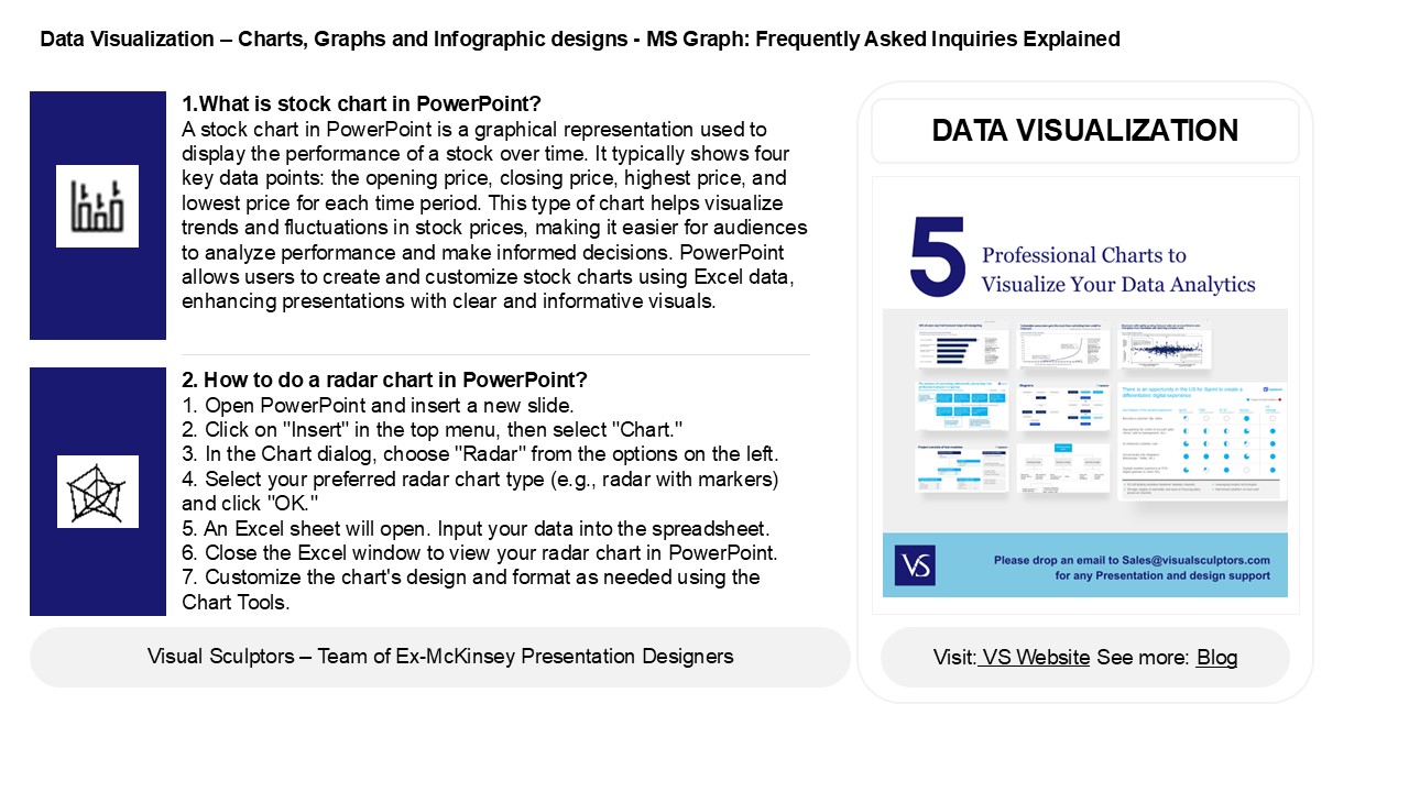
DATA VISUALIZATION
2. How to do a radar chart in PowerPoint? 1.
Open PowerPoint and insert a new slide. 2. Click
on "Insert" in the top menu, then select
"Chart." 3. In the Chart dialog, choose "Radar"
from the options on the left. 4. Select your
preferred radar chart type (e.g., radar with
markers) and click "OK." 5. An Excel sheet will
open. Input your data into the spreadsheet. 6.
Close the Excel window to view your radar chart
in PowerPoint. 7. Customize the chart's design
and format as needed using the Chart Tools.
2
Data Visualization Charts, Graphs and
Infographic designs - MS Graph Frequently Asked
Inquiries Explained
3. What is radar chart in PowerPoint? A radar
chart in PowerPoint is a graphical representation
used to display multivariate data in a
two-dimensional chart. It features a central
point from which multiple axes radiate outward,
each representing a different variable. The data
points for each variable are plotted along the
axes and connected to form a polygon, allowing
for easy comparison of different categories or
data sets. Radar charts are useful for
visualizing strengths and weaknesses, tracking
performance across multiple criteria, and
identifying patterns in complex data. They can be
easily created and customized within PowerPoint's
chart tools.
4. How do you fill a radar chart in PowerPoint?
To fill a radar chart in PowerPoint, first
insert a radar chart by going to the "Insert"
tab, selecting "Chart," and choosing "Radar."
After the chart appears, input your data in the
Excel sheet that opens. To fill the radar chart,
right-click on the area you want to fill, select
"Format Data Series," and choose "Fill" options.
You can select solid fill, gradient, or picture
fill. Adjust the color and transparency to your
preference, then close the formatting pane to see
your filled radar chart.
5. How to make a tree Map in PowerPoint? To
create a tree map in PowerPoint, follow these
steps 1. Open PowerPoint and select the slide
where you want to add the tree map. 2. Go to the
"Insert" tab, click on "SmartArt," and choose
"Hierarchy." 3. Select the "Horizontal Hierarchy"
or any suitable layout. 4. Click "OK" to insert
it into your slide. 5. Enter your data by
clicking on the shapes and typing. 6. Customize
the design using the "SmartArt Design" and
"Format" tabs for colors, styles, and layouts. 7.
Adjust shapes as needed to represent your data
effectively.
Recommended
