
Mastering Waterfall Charts in PowerPoint to Illustrate Cumulative Data Impact PowerPoint PPT Presentation
Title: Mastering Waterfall Charts in PowerPoint to Illustrate Cumulative Data Impact
1
Data Visualization Charts, Graphs and
Infographic designs - MS Graph Top Questions
Answered
1.How to make PowerPoint charts look good? To
enhance PowerPoint charts, follow these tips
choose a consistent color palette that
complements your theme, use clear and legible
fonts, and simplify data by avoiding clutter.
Incorporate contrasting colors for emphasis and
ensure axes are labeled appropriately. Utilize
chart styles and designs that match your
presentations tone. Consider using animations to
reveal data gradually, making it more engaging.
Additionally, maintain adequate white space
around charts to improve readability. Finally,
tailor your charts to the audience's
understanding, focusing on key insights.
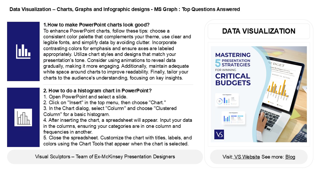
DATA VISUALIZATION
2. How to do a histogram chart in PowerPoint? 1.
Open PowerPoint and select a slide. 2. Click on
"Insert" in the top menu, then choose "Chart." 3.
In the Chart dialog, select "Column" and choose
"Clustered Column" for a basic histogram. 4.
After inserting the chart, a spreadsheet will
appear. Input your data in the columns, ensuring
your categories are in one column and frequencies
in another. 5. Close the spreadsheet. Customize
the chart with titles, labels, and colors using
the Chart Tools that appear when the chart is
selected.
2
Data Visualization Charts, Graphs and
Infographic designs - MS Graph Top Questions
Answered
3. How to create a box and whisker chart in
PowerPoint? To create a box and whisker chart in
PowerPoint, first, open a new slide and go to the
"Insert" tab. Select "Chart," then choose "Box
and Whisker" from the chart options. Enter your
data in the Excel sheet that opens. Once your
data is inputted, customize the chart's design
and layout using the Chart Tools available in
PowerPoint. Adjust colors, labels, and titles as
needed for clarity. Finally, click outside the
chart area to finish and review your presentation.
4. How do I make a box chart in PowerPoint? To
create a box chart in PowerPoint, first, insert a
blank slide. Click on "Insert" in the toolbar,
then select "Chart." Choose "Box Whisker" from
the list of chart types. Input your data in the
Excel sheet that opens, adjusting the values as
needed. After entering your data, close the Excel
window, and your box chart will appear on the
slide. You can customize the chart's design,
colors, and labels using the Chart Tools options
under the "Format" and "Design" tabs. Resize and
position the chart as desired on your slide.
5. How do you create a waterfall chart in
PowerPoint? To create a waterfall chart in
PowerPoint, first insert a chart by selecting
"Insert" gt "Chart" and choose "Column" or
"Waterfall" type. If "Waterfall" isnt available,
create a stacked column chart instead. Enter your
data in the Excel sheet that appears. Adjust the
columns to represent increases and decreases,
using different colors for clarity. Format the
chart by right-clicking on the bars to set
specific values as total or subtotal. Finally,
add labels and titles for better understanding.
Save your work to complete the waterfall chart.
Recommended
