
The Power of Stacked Charts: Leveraging Think-Cell for Clear Data Composition PowerPoint PPT Presentation
Title: The Power of Stacked Charts: Leveraging Think-Cell for Clear Data Composition
1
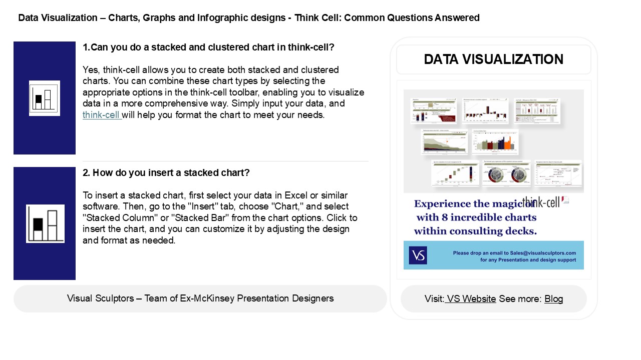
Data Visualization Charts, Graphs and
Infographic designs - Think Cell Common
Questions Answered
- 1.Can you do a stacked and clustered chart in
think-cell? - Yes, think-cell allows you to create both stacked
and clustered charts. You can combine these chart
types by selecting the appropriate options in the
think-cell toolbar, enabling you to visualize
data in a more comprehensive way. Simply input
your data, and think-cell will help you format
the chart to meet your needs.
DATA VISUALIZATION
2. How do you insert a stacked chart? To insert
a stacked chart, first select your data in Excel
or similar software. Then, go to the "Insert"
tab, choose "Chart," and select "Stacked Column"
or "Stacked Bar" from the chart options. Click to
insert the chart, and you can customize it by
adjusting the design and format as needed.
2
Data Visualization Charts, Graphs and
Infographic designs - Think Cell Common
Questions Answered
- 3. What is the use of stacked chart?
- A stacked chart is used to visualize the
composition of different categories within a
whole over a specific time or across different
groups. It allows viewers to see both individual
contributions and the total, making it easier to
compare parts to the whole and identify trends or
changes in data distribution over time.
4. How to use 100 stacked bar chart? A 100
stacked bar chart displays the relative
percentage of different categories within each
bar, allowing for easy comparison across multiple
groups. To use it, ensure your data is structured
with categories as the bars and subcategories as
segments. Each bar represents 100 and the
segments show the proportion of each category
within that total.
5. What is a stacked line chart? A stacked line
chart is a type of graph that displays multiple
data series on the same axes, with each series
stacked on top of the previous one. This allows
for visual comparison of the total value over
time while also showing the contribution of each
individual series. It's useful for highlighting
trends and proportions within the data.
Recommended
