
The Importance of Understanding Stacked Charts in Data Presentation PowerPoint PPT Presentation
Title: The Importance of Understanding Stacked Charts in Data Presentation
1
Data Visualization Charts, Graphs and
Infographic designs - Think Cell Top Questions
Answered
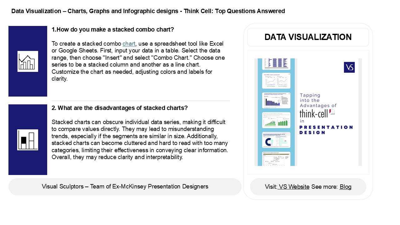
1.How do you make a stacked combo chart? To
create a stacked combo chart, use a spreadsheet
tool like Excel or Google Sheets. First, input
your data in a table. Select the data range, then
choose "Insert" and select "Combo Chart." Choose
one series to be a stacked column and another as
a line chart. Customize the chart as needed,
adjusting colors and labels for clarity.
DATA VISUALIZATION
2. What are the disadvantages of stacked charts?
Stacked charts can obscure individual data
series, making it difficult to compare values
directly. They may lead to misunderstanding
trends, especially if the segments are similar in
size. Additionally, stacked charts can become
cluttered and hard to read with too many
categories, limiting their effectiveness in
conveying clear information. Overall, they may
reduce clarity and interpretability.
2
Data Visualization Charts, Graphs and
Infographic designs - Think Cell Top Questions
Answered
3. What type of graph is stacked? A stacked
graph is a type of chart that displays multiple
data series on top of each other, allowing for
the comparison of parts to a whole. Common
examples include stacked bar charts and stacked
area charts. Each segment represents a different
category, and the total height or length reflects
the cumulative value of all categories combined.
4. What is the difference between stacked and 100
stacked chart? A stacked chart displays the
total values of multiple categories stacked on
top of each other, showing their contribution to
the whole. A 100 stacked chart, however, shows
the same categories but normalizes the total to
100, representing each category's percentage of
the total, allowing for easy comparison across
different groups while maintaining the
proportions.
5. How to read a stacked line graph? To read a
stacked line graph, start by identifying the
different segments for each category represented
by different colors or patterns. Each line shows
the total value across categories, with
individual segments stacked on top of one
another. Observe the height of each segment to
understand the contribution of each category over
time, and compare trends among them.
Recommended
