
Learn from McKinsey, BCG, and Bain Engage & Convey Key Points" PowerPoint PPT Presentation
Title: Learn from McKinsey, BCG, and Bain Engage & Convey Key Points"
1
PowerPoint Storytelling Like McKinsey, BCG And
Bain Common Queries Answered
1. Where can I see examples of storytelling in
McKinsey and BCG presentations? You can find
examples of storytelling in McKinsey and BCG
presentations through their published reports,
case studies, and articles available on their
official websites. Additionally, platforms like
SlideShare and Scribd often host presentations
showcasing their frameworks. Look for materials
that highlight client success stories, strategic
insights, or industry trends, as these typically
incorporate narrative elements to convey messages
effectively.
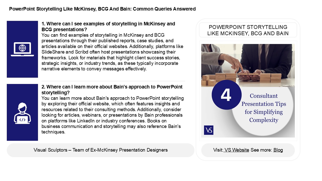
POWERPOINT STORYTELLING LIKE MCKINSEY, BCG AND
BAIN
2. Where can I learn more about Bains approach
to PowerPoint storytelling? You can learn more
about Bain's approach to PowerPoint storytelling
by exploring their official website, which often
features insights and resources related to their
consulting methods. Additionally, consider
looking for articles, webinars, or presentations
by Bain professionals on platforms like LinkedIn
or industry conferences. Books on business
communication and storytelling may also reference
Bain's techniques.
2
PowerPoint Storytelling Like McKinsey, BCG And
Bain Common Queries Answered
3. How can the structure of a PowerPoint
presentation be optimized to reflect a clear
narrative flow, similar to the methodologies
employed by McKinsey, BCG, and Bain? To optimize
a PowerPoint presentation for clear narrative
flow, start with a concise agenda slide outlining
key points. Use the Situation-Complication-Resolu
tion framework present the context, highlight
the challenges, and provide solutions. Structure
each section logically, ensuring smooth
transitions between slides. Employ visuals to
reinforce key messages and maintain audience
engagement, while limiting text to essential
points. Conclude with a strong summary and
actionable recommendations. Lastly, practice
delivering the narrative to enhance coherence and
clarity, mirroring the methodologies of firms
like McKinsey, BCG, and Bain.
4. How can data visualization techniques enhance
storytelling in PowerPoint presentations, and
what specific methods do top consulting firms
employ to convey complex information clearly?
Data visualization techniques enhance
storytelling in PowerPoint presentations by
transforming complex data into intuitive visuals,
making information easier to digest. Top
consulting firms often use methods like
infographics, bar and line charts, heat maps, and
scatter plots to illustrate trends and
comparisons. They emphasize clarity by employing
consistent color schemes, minimal text, and
interactive elements. Additionally, they leverage
storytelling frameworks, integrating visuals with
narratives to guide the audience through the
data, ensuring that key insights resonate and
drive decision-making effectively. This
combination of visuals and narrative creates a
compelling and engaging presentation.
5. In what ways do consulting firms structure
their PowerPoint narratives to ensure clarity and
engagement, and what common frameworks do they
use to guide their storytelling
approach? Consulting firms structure PowerPoint
narratives by using clear frameworks like the
Pyramid Principle, which organizes information
hierarchically, and the MECE (Mutually Exclusive,
Collectively Exhaustive) principle to avoid
overlap. They often start with a compelling
executive summary, followed by key insights
supported by data and visuals. Engaging
storytelling techniques, such as problem-solution
formats, help maintain interest. Consistent
formatting, concise bullet points, and impactful
visuals enhance clarity, while narrative arcs
guide the audience through the message logically,
ensuring both comprehension and engagement
throughout the presentation.
Recommended
