
The Power of Scatter Bubble Charts for Data Analysis PowerPoint PPT Presentation
Title: The Power of Scatter Bubble Charts for Data Analysis
1
Data Visualization Charts, Graphs and
Infographic designs Think Cell Key Queries
Explained
1.How to create a scatter bubble chart? 1.
Gather Data Prepare a dataset with three
columns X values, Y values, and bubble size
values.2. Choose a Software Use tools like
Excel, Google Sheets, or data visualization
software like Tableau or Python (Matplotlib). 3.
Insert Chart In Excel/Sheets, select your
data and insert a scatter plot.4. Format
Bubbles Use the third column to adjust bubble
sizes set the size parameter in chart options.5.
Customize Add titles, labels, and colors to
enhance clarity and presentation.6. Analyze
Interpret the visual relationships in your data.
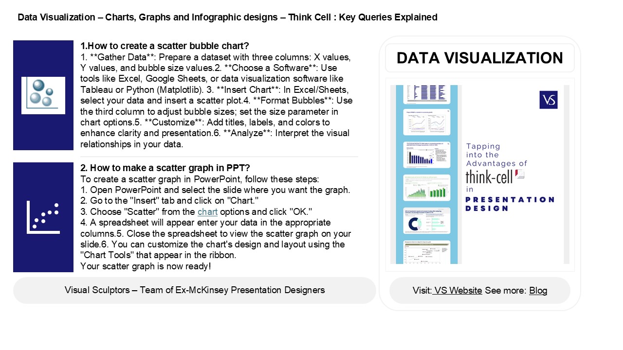
DATA VISUALIZATION
2. How to make a scatter graph in PPT? To create
a scatter graph in PowerPoint, follow these
steps 1. Open PowerPoint and select the slide
where you want the graph. 2. Go to the "Insert"
tab and click on "Chart." 3. Choose "Scatter"
from the chart options and click "OK." 4. A
spreadsheet will appear enter your data in the
appropriate columns.5. Close the spreadsheet to
view the scatter graph on your slide.6. You can
customize the chart's design and layout using the
"Chart Tools" that appear in the ribbon. Your
scatter graph is now ready!
2
Data Visualization Charts, Graphs and
Infographic designs Think Cell Key Queries
Explained
3. Which chart is known as scatter chart? A
scatter chart, also known as a scatter plot or
scatter diagram, is a type of data visualization
that displays values for typically two variables
for a set of data. It uses Cartesian coordinates
to show how much one variable is affected by
another, allowing for the identification of
correlation patterns, trends, and potential
outliers. Each point on the chart represents an
observation, making it useful for analyzing
relationships between quantitative variables.
4. How do I add a bubble chart in PPT? To add a
bubble chart in PowerPoint, follow these steps
1. Open your PowerPoint presentation and select
the slide where you want the chart. 2. Click on
the "Insert" tab in the ribbon. 3. Choose "Chart"
from the options. 4. In the Chart dialog, select
"Bubble" and click "OK." 5. A spreadsheet will
appear enter your data for the bubble chart. 6.
Close the spreadsheet, and the chart will appear
on your slide. 7. You can format and customize
the chart with design options in the "Chart
Tools" tab.
5. Is scatter diagram a graph? Yes, a scatter
diagram is a type of graph. It displays
individual data points plotted on a Cartesian
coordinate system, representing the relationship
between two variables. Each point corresponds to
a pair of values, allowing for visual analysis of
trends, patterns, or correlations in the data.
Scatter diagrams are commonly used in statistics
and data analysis to identify potential
relationships or distributions within datasets.
Recommended
