
Understanding the Visual Distinctions Between Ribbon Charts and Stacked Area Charts PowerPoint PPT Presentation
Title: Understanding the Visual Distinctions Between Ribbon Charts and Stacked Area Charts
1
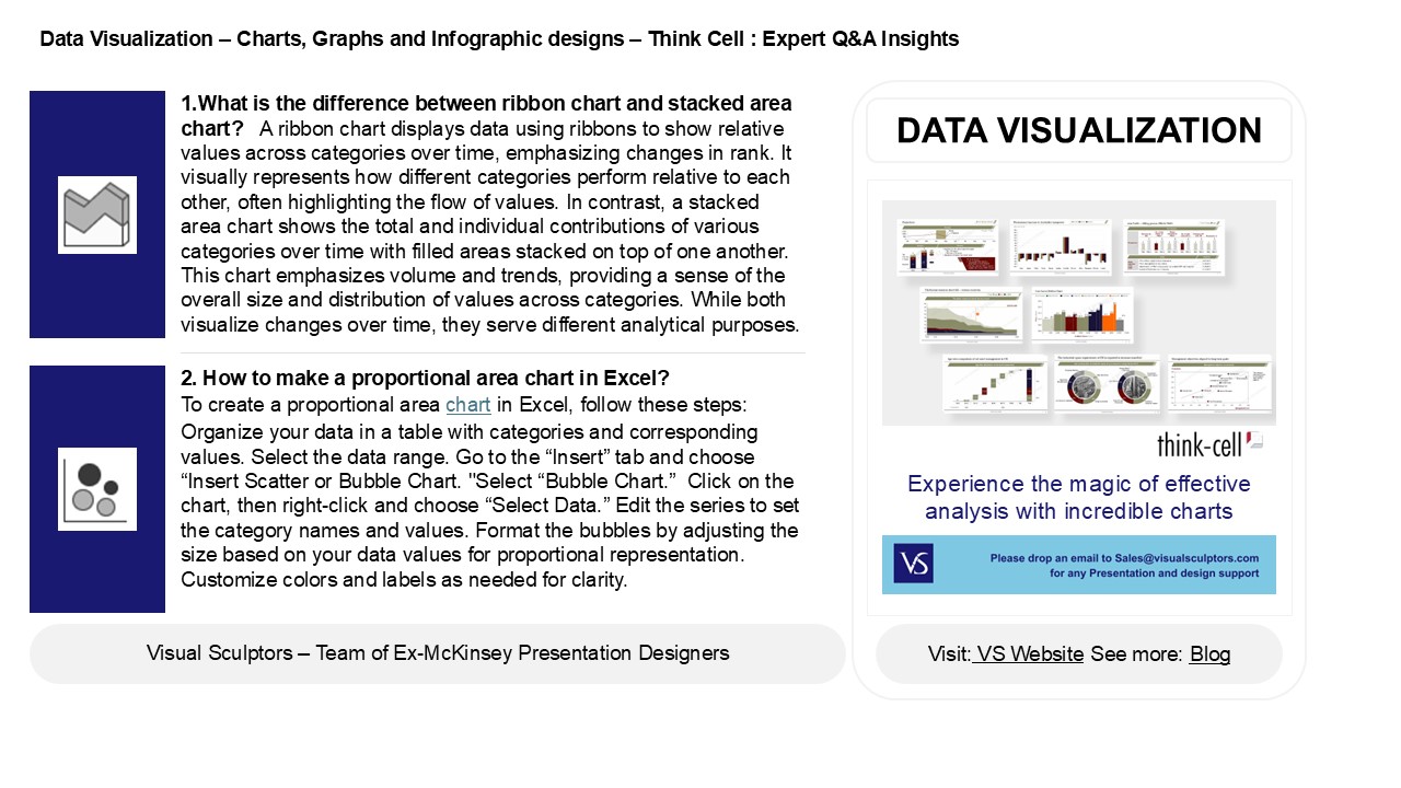
Data Visualization Charts, Graphs and
Infographic designs Think Cell Expert QA
Insights
1.What is the difference between ribbon chart and
stacked area chart? A ribbon chart displays
data using ribbons to show relative values across
categories over time, emphasizing changes in
rank. It visually represents how different
categories perform relative to each other, often
highlighting the flow of values. In contrast, a
stacked area chart shows the total and individual
contributions of various categories over time
with filled areas stacked on top of one another.
This chart emphasizes volume and trends,
providing a sense of the overall size and
distribution of values across categories. While
both visualize changes over time, they serve
different analytical purposes.
DATA VISUALIZATION
- 2. How to make a proportional area chart in
Excel? - To create a proportional area chart in Excel,
follow these steps - Organize your data in a table with categories and
corresponding values. Select the data range. Go
to the Insert tab and choose Insert Scatter or
Bubble Chart. "Select Bubble Chart. Click on
the chart, then right-click and choose Select
Data. Edit the series to set the category names
and values. Format the bubbles by adjusting the
size based on your data values for proportional
representation. Customize colors and labels as
needed for clarity.
2
Data Visualization Charts, Graphs and
Infographic designs Think Cell Expert QA
Insights
3. How to build an area chart? To build an area
chart, follow these steps1. Choose Data
Select the data series you want to visualize,
typically time-based data. 2. Select Chart
Type In your preferred software (like Excel,
Google Sheets, or charting libraries), choose the
"Area Chart" option. 3. Input Data Insert
your data into the chart tool, ensuring the
x-axis represents categories (e.g., time) and the
y-axis shows values. 4. Customize Adjust
colors, labels, and legends for clarity. 5.
Review Analyze the chart for insights and
make any necessary adjustments before finalizing.
4. How to smooth an area graph in Excel? To
smooth an area graph in Excel, select the graph
and go to the "Format Data Series" option. Under
"Fill," choose "Smoothed Line" if available.
Alternatively, you can create a smoothed effect
by using a scatter plot with a line and applying
a moving average. To do this, add a trendline and
select "Moving Average" in the "Trendline
Options." Adjust the period to control the
smoothness. Finally, format the area fill and
line styles to enhance the visual appeal.
5. What is area chart best for? An area chart is
best for visualizing cumulative data over time,
showcasing trends and changes in quantities. It
effectively illustrates the magnitude of values
relative to a baseline, making it ideal for
displaying the total contributions of different
categories to a whole. Area charts are
particularly useful for comparing multiple data
series, highlighting relationships, and
emphasizing the volume of data across time
periods. However, they can become cluttered with
too many series, so clarity should be prioritized
for effective communication of the information.
Recommended
