
The Impact of Summaries and Table of Contents on Readability PowerPoint PPT Presentation
Title: The Impact of Summaries and Table of Contents on Readability
1
Dos and Don'ts of Report Design Frequently Asked
Questions Explained
1. How can the use of white space in report
design improve the overall presentation and
comprehension of the content? The use of white
space in report design enhances presentation and
comprehension by creating visual breathing room,
which helps to reduce clutter and distractions.
It guides the reader's eye, emphasizing key
elements and improving readability. Adequate
white space allows for better organization of
information, making it easier to navigate and
understand. It also aids in distinguishing
between sections, thereby enhancing overall flow
and coherence.
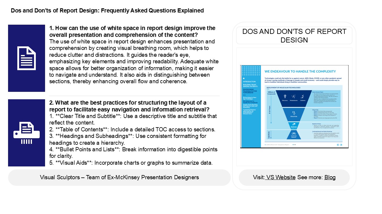
DOS AND DON'TS OF REPORT DESIGN
2. What are the best practices for structuring
the layout of a report to facilitate easy
navigation and information retrieval? 1. Clear
Title and Subtitle Use a descriptive title and
subtitle that reflect the content.2. Table of
Contents Include a detailed TOC access to
sections.3. Headings and Subheadings Use
consistent formatting for headings to create a
hierarchy.4. Bullet Points and Lists Break
information into digestible points for
clarity.5. Visual Aids Incorporate charts
or graphs to summarize data.
2
Dos and Don'ts of Report Design Frequently Asked
Questions Explained
3. How can incorporating data visualization
techniques, such as charts and graphs, improve
the impact of a report, and what mistakes should
be avoided in their use? Incorporating data
visualization techniques like charts and graphs
enhances a report by making complex information
more accessible and engaging, allowing readers to
quickly grasp key trends and insights. Effective
visuals can also highlight important data
relationships and support decision-making.
However, mistakes to avoid include using
cluttered or overly complex visuals, selecting
inappropriate chart types, misrepresenting data
scales, and neglecting to provide context or
explanations. Ensuring clarity, accuracy, and
relevance in visuals is essential for maintaining
credibility and effectively communicating the
report's message.
4. What are the key elements that should be
included in a report to enhance clarity and
comprehension for the intended audience? Key
elements for enhancing clarity and comprehension
in a report include a clear purpose statement, a
well-structured format with headings and
subheadings, concise language, and bullet points
for key information. Use visuals such as charts
and graphs to illustrate data. Incorporate an
executive summary to provide a quick overview and
ensure a logical flow of ideas. Tailor the
content to the audiences knowledge level,
avoiding jargon where possible. Finally, include
a conclusion that summarizes findings and
suggests actionable recommendations.
5. What common mistakes should be avoided when
choosing color schemes and fonts in report design
to ensure readability and professionalism? When
choosing color schemes and fonts for report
design, avoid using overly bright or clashing
colors that can strain the eyes. Stick to a
limited palette with high contrast for text and
background to enhance readability. Use no more
than two or three fonts select professional,
easy-to-read options like sans-serif or serif
fonts. Avoid decorative or overly stylized fonts
that may compromise clarity. Ensure sufficient
white space to prevent clutter and make the
content accessible. Finally, consider
colorblind-friendly palettes to accommodate all
readers.
Recommended
