
The Role of Keylines in Icon Grid Design PowerPoint PPT Presentation
Title: The Role of Keylines in Icon Grid Design
1
Icon Grids and Keylines Common Questions Answered
1. What are icon grids, and how do they
contribute to effective visual communication in
design? Icon grids are structured layouts that
organize icons or visual elements in a systematic
manner. They enhance effective visual
communication by providing a clear, consistent
framework that guides the viewers eye, making
information easier to digest. By maintaining
alignment and spacing, icon grids create a
harmonious design that improves usability and
comprehension. This organization helps convey
messages quickly, as users can easily identify
and interpret visual cues.
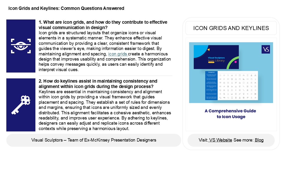
ICON GRIDS AND KEYLINES
2. How do keylines assist in maintaining
consistency and alignment within icon grids
during the design process? Keylines are essential
in maintaining consistency and alignment within
icon grids by providing a visual framework that
guides placement and spacing. They establish a
set of rules for dimensions and margins, ensuring
that icons are uniformly sized and evenly
distributed. This alignment facilitates a
cohesive aesthetic, enhances readability, and
improves user experience. By adhering to
keylines, designers can easily adjust and
replicate icons across different contexts while
preserving a harmonious layout.
2
Icon Grids and Keylines Common Questions Answered
3. What are some best practices for creating icon
grids that ensure scalability and adaptability
across different screen sizes and
resolutions? Best practices for creating scalable
and adaptable icon grids include using vector
graphics for resolution independence, employing a
flexible grid layout for responsiveness, and
ensuring consistent icon sizes and spacing.
Implementing a modular design approach allows for
easy rearrangement on various screen sizes.
Utilize media queries to adjust icon grid
configurations based on device characteristics.
Additionally, consider touch targets for mobile
usability and maintain visual hierarchy to
enhance user experience across devices. Finally,
test across multiple resolutions to ensure icons
remain legible and functional.
4. In what ways can the use of keylines enhance
the usability and accessibility of icons in user
interface design? Keylines enhance the usability
and accessibility of icons in user interface
design by providing clear visual boundaries and
guiding users attention. They help to define the
shape and function of icons, making them more
recognizable and easier to understand. This
improves cognitive processing, especially for
users with visual impairments. Keylines also
create a consistent visual language, aiding in
navigation and reducing confusion. By ensuring
that icons are distinct and well-defined,
keylines contribute to a more inclusive design
that accommodates diverse user needs and enhances
overall user experience.
5. How can designers effectively balance
aesthetic appeal and functional clarity when
designing icon grids with keylines? Designers can
balance aesthetic appeal and functional clarity
in icon grids with keylines by adhering to a few
key principles maintain consistent spacing and
alignment for visual harmony, use a limited color
palette to enhance readability, and choose easily
recognizable icons that convey their purpose
clearly. Incorporating subtle keylines can help
define space without overwhelming the design.
Additionally, testing with users can provide
feedback on clarity and aesthetics, ensuring that
the design is both visually appealing and
functionally effective. Prioritizing usability
while keeping a clean, cohesive look is essential
for successful icon grid design.
Recommended
