PATRICK CAULFIELD - PowerPoint PPT Presentation
1 / 21
Title: PATRICK CAULFIELD
1
PATRICK CAULFIELD
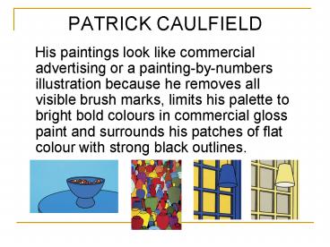
- His paintings look like commercial advertising
or a painting-by-numbers illustration because he
removes all visible brush marks, limits his
palette to bright bold colours in commercial
gloss paint and surrounds his patches of flat
colour with strong black outlines.
2
- Caulfield's painting style was in part a
reaction to the highly personalised painting
style of Abstract Expressionism, but he was also
strongly influenced by Fernand Leger and the
Cubist painter Juan Gris.
3
- Caulfield's domestic interiors are often lifted
directly from 1950s interior decorating magazines
and they retain their original aspirational
mood. Devoid of narrative, Caulfield
nevertheless imbues each canvas with a powerful
emotional register by suffusing them with a
dominant saturated colour. Frequently
melancholic, these interiors are always totally
still and without a human presence except maybe
for a light left on.
4
Sweet bowl 1967
5
- Pottery
- 1969
6
- Interior Noon 1970 Interior Morning 1970
7
- Napkins and Onions
- 1972
- Colour Screenprint
8
(No Transcript)
9
- Ah! Storm clouds rushed from the Channel coasts
- 1973
10
- Oh! If one of them, some fine evening would try
- 1973
11
- R and I am alone in my house
- 1973
- Screenprint
12
- E Ill take my life monotonous
- 1973
- Screenprint
13
- L And, with my eyes bolting toward the
Unconscious - 1973
- Screenprint
14
- Ah! This life is so every day
- 1973
- Screenprint
15
- She fled down the avenue
- 1973
- Screenprint
16
- After Lunch
- 1973
17
Oh Helen I roam 1973 Jug 1974
18
Glazed Earthenware 1976
19
Still Life, Autumn Fashion 1978
20
Interior with a picture 1985-6
21
- Interior with a Picture 1985 - 6
- This large oil painting shows a domestic
interior. But instead of choosing a traditional
view of a sitting room, bedroom or dining room,
Caulfield has focussed on a confined area that is
the junction between a landing and two corridors.
All the elements are perspectivally correct,
but greatly simplified. The effect is to make
the space seem simultaneously real and
cartoon-like. Although the distance between the
viewer and the furthest point in the scene is
perhaps no more than twelve feet, there is
nevertheless a strong sense of depth within the
picture. This is because the foreground, middle
ground and background are strongly delineated by
the architecture and divide the canvas into
thirds.
- As we look at this painting, we appear to be
standing near the end of a corridor. There is a
wall to our right and ahead of us, in the
background, is the base of a staircase seen in
profile that leads upwards to the right. Between
the staircase and us, occupying the middle ground
is the opening to a second corridor that
disappears off to our right. This corridor runs
in front of and parallel to the staircase. The
paintings composition across the canvas is also
divided into thirds. The left hand side of the
canvas is taken up with the area at the bottom of
the flight of stairs, which consists of a newel
post and the first strut of the banisters. The
middle of the painting contains the corridor wall
facing us and, since we are placed at a slight
angle to the corridor, we can see a short way
down its length. This middle section of the
painting is the most complex and contains the
most detail, since the top third of this corridor
wall is covered with heavily patterned wallpaper
in scarlet and bright yellow. The wall below the
paper is painted in a deep red and separating the
two is a dado rail. Hanging right at the end of
the corridor but almost central to the picture as
a whole, is a still life painting of a jug,
glass, candle and plate. This painting within
the painting stands out strongly because unlike
the simplified forms and flattened colour of the
surrounding architecture, the still life has been
painted in a highly realistic manner. Directly
below the still life and under the dado rail is a
large oval shape that stands slightly proud of
the wall, like a plaster moulding. - The right hand side of the painting involves the
intersection of the right hand corridor with the
one in which we appear to be standing. The wall
to our right gives the impression of running on
past our shoulder, while the angle it creates
where it joins the short spur of the corridor
wall, is emphasised by the dado rail that runs
around both walls and off the edge of the
canvas. This whole painting is saturated with
deep reds and warm orange-browns that provide an
intense contrast with the yellow wallpaper and a
number of patches of green and blue in and around


![[PDF]❤️DOWNLOAD⚡️ The Gentleman From New York : Daniel Patrick Moynihan: A Biography PowerPoint PPT Presentation](https://s3.amazonaws.com/images.powershow.com/10038376.th0.jpg?_=20240524044)

![READ⚡[PDF]✔ PATRICK DEMPSEY: The Iconic Biography of Hollywood Actor who starred in Grey's PowerPoint PPT Presentation](https://s3.amazonaws.com/images.powershow.com/10062859.th0.jpg?_=20240624072)
![⚡[PDF]✔ You Shamrock My World: A Sweet and Lucky St. Patrick's Day Board Book for PowerPoint PPT Presentation](https://s3.amazonaws.com/images.powershow.com/10065063.th0.jpg?_=20240626013)
![[PDF] DOWNLOAD St. Patrick's Day Joke Book: Celebrate St. Paddy's Day PowerPoint PPT Presentation](https://s3.amazonaws.com/images.powershow.com/10065667.th0.jpg?_=20240627013)
![[PDF READ] Free Not a Number: Patrick Mcgoohan - a Life PowerPoint PPT Presentation](https://s3.amazonaws.com/images.powershow.com/10079044.th0.jpg?_=20240716034)


