
Understand Responsive Website Design: Components & Features - PowerPoint PPT Presentation
Title:
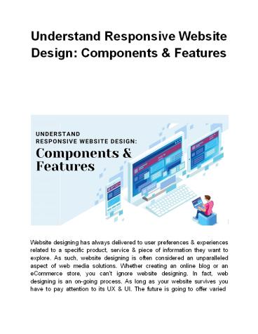
Understand Responsive Website Design: Components & Features
Description:
Website designing has always delivered to user preferences & experiences related to a specific product, service & piece of information they want to explore. As such, website designing is often considered an unparalleled aspect of web media solutions. Whether creating an online blog or an eCommerce store, you can’t ignore website designing. In fact, web designing is an on-going process. Read more on – PowerPoint PPT presentation
Number of Views:32
Title: Understand Responsive Website Design: Components & Features
1
Understand Responsive Website Design Components
Features
Website designing has always delivered to user
preferences experiences related to a specific
product, service piece of information they want
to explore. As such, website designing is often
considered an unparalleled aspect of web media
solutions. Whether creating an online blog or an
eCommerce store, you cant ignore website
designing. In fact, web designing is an on-going
process. As long as your website survives you
have to pay attention to its UX UI. The future
is going to offer varied
2
devices for internet surfing that will be
different in terms of shapes sizes of the
display. The display of a smart device is
usually called the heart of that device that
needs to be pumped consistently alternatively.
Technology is booming like never before and
internet users are keen to have new experiences
that could change their life standard of
living. When advanced LED LCD screens came
into existence, they essentially replaced the old
screens. The reason was a more enhanced
eye-conscious idea of user experience. The same
reason has emerged as the concept of Responsive
Web Design in the past few years. In this
article, we will comprehensively discuss the
various constituents of Responsive Website Design
how you can make use of them to optimize your
online appearance. But before proceeding, heres
a brief introduction to our services. SFWP
Experts is an award-winning website designing
development company based in San Francisco. Our
innovative custom WordPress website designer
team caters to your business model exceptionally
lets you deliver the best user experience for
your website visitors! About Responsive Website
Design Technology keeps growing as the market
places are never out of expectations. These
expectations encourage modern inventors to keep
creating revolutionary devices gadgets. A
Websites Responsive Design is also encouraged
by the user expectation addressing internet
surfing on the palm. Earlier they had to go to a
nearby cyber cafe to execute a little search
query. Nevertheless of its leading disadvantages,
technology has always provided for human comfort
so far. A responsive website design is a
solution to the smartphone users needs.
3
- A responsive website design makes use of flexible
grids layouts to deliver to the different
screen sizes, resolutions UI requirements of
the internet users based on their devices. That
means if you dont have a responsive website
design you cant count on each and every possible
source of traffic out there. You have to manage
with a limited number of visitors who also have
other alternatives on the SERPs. - How Does a Responsive Website Design Work?
- A responsive website design actually lets the
user devices do half of the work. Responsive
designs are conscious of user behavior and their
choice of device whether TV, Desktop, Laptop,
Tablet, Mobile Phone, or Virtual Reality. A
responsive website design is always inspired by
the accumulation of the enlisted factors - User Experience (UX)
- User Interface (UI)
- Content Structure of the website
- Navigation Menu if the website
- Thumb Zone Convenience of the user
- Screen Resolution of the device
- Screen Size of the device used by the user
- Features of the device like motion sensor, screen
rotation, etc - Internet surfing behavior of the user
- Considering all these factors we can conclude 3
important principles of Responsive Website
Design that contribute to its overall
functionality. Going through these principles
youll understand how an effective responsive web
design strategy works. Lets have a look at the
same - Fluid Grid Functionality
4
- user. The Fluid Grid System relates to the
relative sizes the users can go for associated
with the devices. Finding the relative sizes as
such could be a time-consuming technique, dont
you think? But not with the right mathematical
approach. Theres a formula we suggest you find
the relative size of your website pages. - Relative Size Target Size / Context
- The result could be concluded as the percentage
of the target size on your wrapper with respect
to the browser width on the users device. A web
wrapper is simply a web designing technique
through which you can adjust headers footers
on your specified website pages. - You can make further alterations to various child
elements on your wrapper using a Fluid Grid
Functionality. You can use the relative size
further in the CSS Script to adjust the
properties comprising Length, Width, Margin, etc. - Fluid Image Functionality
- The approaching principle forgets the layout
focuses on the visual portion of your website
content. You have to again dive into the
technical portion approach the CSS Command as
follows- imgmax-width100. Following this
command, you dont have to care about the browser
your website user is using. Your website images
could create problems if not in a position to
provide for varied resolutions user devices.
Therefore, you have to do such web designing
hacks protect your website traffic. There are 2
things you need to keep in mind - The pixel value of the image needs to be 100
- The image should scale according to the
corresponding container its going to acquire - Your website images never look stretched or
shrunk with respect to varied resolutions size
prerequisites out there on the user devices
browsers.
5
Another solution could be using dedicated CMS
like WordPress for all your designing
operations. Certain WordPress themes come with
pre-installed layouts that provide for your
Fluid Image Functionality effectively.
Additionally, youve got the revolutionary
WordPress Plugin Support for all your responsive
design strategies. For revenue-generating Custom
WordPress Website Designing Development
support you can consult web designing
specialists at SFWP Experts anytime! Stay
Conscious of Media Media queries can help you in
multiple ways to alter your web design against
the emerging user requirements for layout. You
again have to make use of CSS Scripting to come
up with different media queries as per the user
convenience. You can represent your website
responsiveness requirements in the command with
respect to whatever is approaching your web
designing plan. There could be multiple
breakpoints affecting the responsive design
strategy that you have to predict entail your
media queries accordingly. Apart from this, you
have to take care of the right framework for your
responsive website design. The one wed like to
suggest here is an existing framework. An
existing framework could save a lot of your time
and efforts in creating a new one. Your web
application could be your ultimate step to web
popularity presence as users are switching to
smartphones rapidly and you have to serve them
an enhanced version of your web services,
resources APIs as such. Your website content
is your foremost key to success. No matter how
responsive your website design is, you have to
deliver quality content at any cost. Quality
content is one of the leading requirements of the
Google Algorithms list therefore we suggest
you hire a good content writing team at your
workplace premises.
6
Conclusion In the end, we need you to stay
conscious of the turning trends in the web
designing development world. The more changes
you experience, the more opportunities for
learning to grab. At SFWP Experts we not only
intensify your web presence but also spread
awareness about the emerging website building
issues. In case you have any other queries
related to Custom Website Design Development
services, you can reach us right
away!! Contact Details 213-277-9177 la_at_sfwpex
perts.com Visit Reference Profile
Websites http//bit.ly/3pX7Qu4
http//bit.ly/2NYaOBs http//bit.ly/2MqUpVI
https//bit.ly/2Z4LJqj https//bit.ly/3hX3kJv
https//bit.ly/3hXqDms http//bit.ly/3fLc8jM
7
http//bit.ly/2YuAFny http//bit.ly/3ewLTgF
https//bit.ly/37RuLRD http//bit.ly/3kxiCpZ
http//bit.ly/3knPvpb http//bit.ly/37Rps4x
http//bit.ly/3aVBqvV http//bit.ly/3uC9Vzd
http//bit.ly/3uyBCZI http//bit.ly/37P363K
Recommended
CrystalGraphics Presentations


