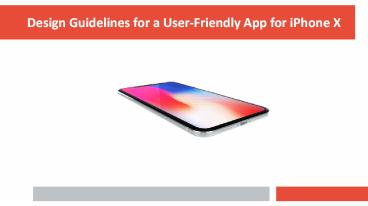
iPhone X Design Guidelines for a User-Friendly App
Title:
iPhone X Design Guidelines for a User-Friendly App
Description:
Follow these iPhone X UI guidelines to create a user-friendly app for it. Taking care of these guidelines while designing apps for iPhone X will ensure that user never experiences any problems while accessing its apps. Learn more about these user-friendly iOS app – PowerPoint PPT presentation
Number of Views:24
Title: iPhone X Design Guidelines for a User-Friendly App
1
Design Guidelines for a User-Friendly App for
iPhone X
2
Why design specifically for iPhone X?
- Every time Apple brings in new version of iPhone,
it doesn't change the user experience as much as
they have done it for iPhone X. - It means the designers and developers will now
have to develop the iOS apps specific to iPhone X
with its edge-to-edge screen and no home button. - Hence, it is difficult to develop the apps
successfully for iPhone X, but there are some
tips that you should take care of while designing
for iPhone X.
3
iPhone X Design Tips
- Here are some tips that should be taken care of
while designing for iPhone X
- Taking care of the screen size
- Realign the interface elements
- Don't hide the notch
- iPhone X status bar
- Taking care of the app's content
- Impact of colors
- iPhone X aspect ratio
- Full screen experience
- Follow iPhone X design guidelines
- Design apps for landscape mode as well
- Take care of website
- Avoid using system-like gestures
4
Realign the interface elements
- The layout of interface elements needs to be
rearranged, as we get 70 points more to place the
content of the app as compared to 570 points in
iPhone 6, iPhone 7 and iPhone 8.
Image Credit Hackernoon
5
Don't mask the notch
- Don't mask the notch or hide it in any other ways
like coloring the navigation bar into black. This
will make the app layout small and inconsistent
as compared to other apps.
Image Credit Adobe
6
Don't hide the status bar
- The status bar in iPhone X has gone taller from
22 points to 44 points. - Don't hide the status bar while designing any app
as the users might want to see whether they are
connected to Wi-Fi when the app regularly
downloads the content from the internet.
Image Credit Adobe
7
Impact of colors
- Use P3 instead of sRGB to make use of the wide
spectrum of colors available in the phone's
display.
Image Credit Hackernoon
8
Mind the iPhone X aspect ratio
- Artworks designed for iPhone 8 will get cropped
or letterboxed, when used for iPhone X. So, they
need to be designed specifically for iPhone X.
Image Credit Apple
9
Full screen experience
- Extend the backgrounds to the edges of the
display to provide full screen experience to the
users. The vertically scrollable layout is
extendible to the bottom of the screen.
Image Credit Apple
10
Design apps for landscape mode as well
- Apps for iPhone X needs to be designed for
landscape mode as well for viewing content like
photos, videos, texts in full screen - In landscape mode, status bar is hidden,
navigation bar gets reduced to 32 points from 44
points and tab bar size gets resized from 49
points to 30 points
Image Credit Hackernoon
11
Take care of website
- With website access in landscape mode, much space
is left at top and bottom, while taking care of
the safe area. So, the website needs to be
designed in full screen, while opening it in
landscape mode.
Image Credit Hackernoon
12
Avoid using system-like gestures
- In iPhone X, Apple has removed one essential
feature home button. It means that gestures do
all the manipulations. - To access other apps and home screen, one has to
swipe upwards from the bottom edge of the
display, which is called home indicator. - Don't place any interactive element in the home
indicator area.
Image Credit Apple
13
General iPhone App Design Guidelines
- Apart from the given tips, some general iPhone
App Design Guidelines require adherence. The
design should - Garner the user's attention
- Focus on uniformity
- Center target audience
- Fulfill the application purpose
14
To conclude
- These design guidelines will ensure that the user
never experiences any problems while accessing
applications on iPhone X. - Follow these design guidelines to ensure a
user-friendly iOS app for iPhone X.
15
Thank You


