Introduction - PowerPoint PPT Presentation
1 / 5
Title:
Introduction
Description:
Craigslist.com wants to provide community info for the Web. ... ( There's also too much going on between the breadcrumbs and the list of geographic regions. ... – PowerPoint PPT presentation
Number of Views:52
Avg rating:3.0/5.0
Title: Introduction
1
- Introduction
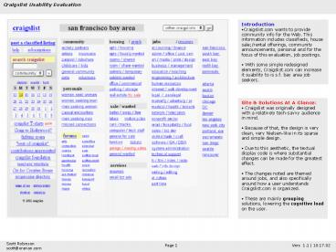
- Craigslist.com wants to provide community info
for the Web. This information includes
classifieds, house sale/rental offerings,
community announcements, personal and for the
focus of this evaluation, job postings. - With some simple redesigned elements,
Craigslist.com can increase it suability to is
s.f. bay area job seekers.
- Site Solutions At A Glance
- Craigslist was originally designed with a
relatively tech-savvy audience in mind. - Because of that, the design is very clean, very
Nielsen-like in its sparse and simple design. - Due to this aesthetic, the textual display code
is where substantial changes can be made for the
greatest effect. - The changes noted are themed around jobs, and
also specifically around how a user understands
Craigslist.com is organized. - These are mainly grouping solutions, lowering
the cognitive load on the user.
2
- Problems
- Lots of jobs to choose from. On the home page
there are 24 groupings of jobs. - Job seekers go straight to this section of the
page. Once entering the pages of this section,
users want to browse around the different job
groupings. - Since there are 24 of them, your ideal job might
not fit into just one of these groupings. - For example, would you put a human factors job
under "internet engineering jobs", or "web design
jobs" or "software jobs"?
- Some additional comments about the home page
- Although grouping is done well overall, the
title of the page, san francisco bay area, isn't
visually attached to the rest of the content.
With all of these blocks of text, it is hard to
group them accordingly. - This site may be for the benefit of tech-savvy
users, but the use of a greater-than sign instead
of "search" or "go" for the search submit button
is unconventional. Also, the search text field is
quite limiting due to it small width. - One great element on this page is the user of
red as a pop-out to show new content areas.
3
- Problems
- This is where you might get into trouble.
- There is no one-to-one matching of the original
24 job groupings on the home page, and the 24 job
groupings provided in the drop-down menu
displayed throughout the jobs section. - This inconsistency in language shows a lack of
visual momentum, requiring a higher cognitive
load on the user to decide what action to take.
- Redesign
- The simplest redesign would be to match one on
to the other, preferably to match the home page
job groupings on to the drop-down menu.
4
- Problems
- A job seeker will usually explore the locations
of jobs. - This step can be confusing due to a design
choice. There is - no clear hierarchy, on the home page or in the
jobs section, of the difference between s.f.
bayarea sub-regions (san francisco, south bay,
etc.). - Even on the top of the jobs pages, the
structure, with pipes between each subgroup, is
confusing and doesn't help me understand the
hierarchy. (There's also too much going on
between the breadcrumbs and the list of
geographic regions.)
- Redesign
- By providing some visual hierarchywith bold
type and indentationto these elements on the
home page this clarification will be made when it
is first presented. - In addition, providing similar hierarchy in the
jobs section (although not in the same vertical
design, but still accomplishing the same purpose)
it is reiterated and provides redundant
information and valuable grouping of information
to the user.
5
- Problems
- The problem with the locations of jobs comes
into play when a user is trying to post a resume. - The site requires you to choose a sub-region of
the s.f bayarea in order to get to the posting
process (it's the first step, shown in the screen
shot to the left). - But what's the difference between these choices?
What, for example, constitutes south bay and not
peninsula? - Without additional cues, mislabeling could run
rampant. (This is especially true if they don't
know that s.f. bayarea is the uber-region for
all of these sub-regions).
- Redesign
- Provide a list of cities for reference for each
of these sub-regions to help posters get through
this process. - In addition, a labeled map would help those not
knowledgeable of the s.f. bayarea to help them
understand the context of the site as a whole.
(The map won't help in specific bordering areas
unless it's detailed enoughthus the list of
cities can help provide specific answers.)


