Typography - PowerPoint PPT Presentation
1 / 28
Title:
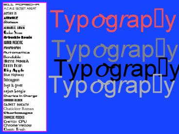
Typography
Description:
Pre-pre-digital technology was even more manual, as typesetters had to pour ... For me, the strength of photography lies in its ability to evoke a sense of humanity. ... – PowerPoint PPT presentation
Number of Views:79
Avg rating:3.0/5.0
Title: Typography
1
Typography
Typography
Typography
Typography
2
Typography
The art of selecting or arranging type using
type in various graphic designs to obtain
particular effects . . .
3
Printing, scholars suggest, leads to the
development of a linear mode of thinking
(generated by lines of type we become used to
reading). This leads indirectly to individualism
and nationalism.
4
Before Gutenberg, various civilizations had
developed a variety of alphabets and methods for
writing . . .
5
Ever since Johannes Gutenburg developed movable
type in 1440 and revolutionized communication by
making books available to the masses,
typographers have been developing different
typefaces and artists have been experimenting
with graphic design . . .
Printing Press (not an electric chair)
6
TYPEFACES
We describe the size of type in points and picas,
not inches. There are approximately 12 points to
a pica and 6 picas to an inch.
10 12 16 20 24 32 36 48 60 80
7
Pre-pre-digital technology was even more manual,
as typesetters had to pour their own lead to make
type that would be set by hand . . .
8
Pre-digital page layout techniques
9
Setting type in the 70s
10
The personal computer, and then the laser and
inkjet printers, made self-publishing possible
for everyone
11
Serif vs. Sans Serif Typefaces It is generally
believed that serif faces are easier to read
because the serifs help tie the letters of a word
together . . . Sans serif fonts are considered
to have a cleaner, more contemporary look . . .
Ancient typewriter
A not so ancient typewriter
12
Text vs. Display Text typefaces (like this one)
are easy to read, and are used for books,
magazines, newspapers, etc.
Display typefaces (like this one) are used in
titles or headings, and are meant to generate a
certain feeling or convey an attitude or
idea. Setting type the way grandpa used to do
it . . .
13
Old English Roman Typefaces
Roman typefaces were developed in the 15th
Century, modeled after Roman scribes. There are
three main styles Old style, with rounded
serifs and little variation in thickness
Transitional, with more open letters and rounded
serifs (like this one, called Baskerville)
Modern, with more contrast between thick and
thin lines, and with thin, straight serifs, like
this one, called Hoefler.
Old English typefaces are similar to the one used
by Gutenberg in printing his Bible. He developed
it out of manuscript letter style used by
medieval scribes.
14
Light, Bold Italics
Not only are there many typefaces, but most
typefaces can be used in many styles and
different sizes. American Typewriter (italics)
(italics bold) American Typewriter
Condensed American Typewriter Condensed
Light American Typewriter Light
Arial (Arial italics) Arial Black Arial
Narrow Arial Rounded MT Bold
Copperplate (Italics) Copperplate gothic
bold Copperplate gothic light Copperplate light
15
CAPITAL or lower case? Lower case letters have a
different design from capitals and are not just
small capital letters. LOWER CASE LETTERS HAVE A
DIFFERENT DESIGN FROM CAPITALS AND ARE NOT JUST
SMALL CAPITAL LETTERS. There is more white space
around small letters, which makes them easier to
read as text.THE UPPER CASE LETTERS ALSO TAKE UP
MORE SPACE.
16
Maximizing the IMPACT of type
Type size affects the design LEADING The amount
of white space between the lines of text can
determine whether the type has a light, open
look, or if the lines of text are leaded too
closely together the feeling can be dense and
heavy.
KEARNING The amount of white space between the
letters can be extended or condensed.
17
MARGINS ALIGNING THE TEXT
Justified Left
For me, the strength of photography lies in its
ability to evoke a sense of humanity. If war is
an attempt to negate humanity, then photography
can be perceived as the opposite of war and if it
is used well it can be a powerful ingredient in
the antidote to war.
Justified right
For me, the strength of photography lies in its
ability to evoke a sense of humanity. If war is
an attempt to negate humanity, then photography
can be perceived as the opposite of war and if it
is used well it can be a powerful ingredient in
the antidote to war.
18
Centered text
For me, the strength of photography lies in its
ability to evoke a sense of humanity. If war is
an attempt to negate humanity, then photography
can be perceived as the opposite of war and if it
is used well it can be a powerful ingredient in
the antidote to war.
19
Justified
For me, the strength of photography lies in its
ability to evoke a sense of humanity. If war is
an attempt to negate humanity, then photography
can be perceived as the opposite of war and if it
is used well it can be a powerful ingredient in
the antidote to war.
20
(No Transcript)
21
(No Transcript)
22
(No Transcript)
23
(No Transcript)
24
(No Transcript)
25
(No Transcript)
26
(No Transcript)
27
(No Transcript)
28
(No Transcript)


