What is Responsive Web Design? - PowerPoint PPT Presentation
Title:
What is Responsive Web Design?
Description:
Responsive web design makes your web page look good on all devices. Read more about... Call F5 Buddy at 070005 25861 and get Responsive Web Design for more visit at – PowerPoint PPT presentation
Number of Views:18
Title: What is Responsive Web Design?
1
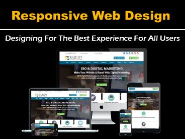
Responsive Web Design
Designing For The Best Experience For All Users
2
What Is Responsive Web Design?
- Responsive web design makes your web page look
good on all devices. - Responsive web design uses only HTML and CSS.
- Responsive web design is not a program or a
JavaScript.
3
Designing For The Best Experience For All Users
- Web pages can be viewed using many different
devices Desktops, Tablets, and Phones. Your web
page should look good, and be easy to use,
regardless of the device - Web pages should not leave out information to fit
smaller devices, but rather adapt its content to
fit any device
4
(No Transcript)
5
- In 2015, Google rolled out a change to the search
engine algorithms which now factor in a websites
mobile presence as a ranking signal. - Simply put, a website needs to be usable on a
Smartphone. - This includes elements such as
- Readable text without requiring zoom,
- And no horizontal scrolling.
- Can you recall the shrunken version of a
desktop site - on your phone?
- It was likely not a good experience!
6
Why Important Is Responsive Design?
- 7.6 billion world population is the total number
of Humans. - Mobile phone users is 4.77 billion.
- Means 62.76 peoples use Mobile Phones in world
population.
7
Benefits of Responsive Web Design
- Breakpoints
- Breakpoints basically define limits for how wide
design elements on your website can be. To
account for the width of larger desktop screens,
content is usually broken up into three columns,
while Smartphone's will usually have just one.
8
Breakpoints
9
2. Responsive sites improve SEO rankings.
One website for multiple devices easier
SEO management When your site is responsive you
are able to focus all of your SEO efforts on ONE
single site rather than having to build and
maintain rankings separately for mobile and
desktop counterparts.
10
3. Mobile Shopping is on the Rise Weve touched
on this before but its important to reiterate
just how important mobile phones are becoming to
the shopping experience. 80 of shoppers will
make consistent use of their mobile phones to
shop online.
11
4. Improved Local Speed on Mobile. According to
Google Page Speed Developers Standards recommend
that the content above the fold on a mobile
device should load in under 1 second, while the
whole page loading in under 2 seconds. When
users have to wait longer for a page to load they
will most likely leave your site and choose to go
elsewhere, which is why having a responsive
design is important.
12
_at_media Screen Examples
1 Extra large screen gt 1200px 2 Large
screen 900px 1200px 3 Medium screen 600px
900px 4 Small screen 300px 600px 5 Tiny
screen lt 300px
13
(No Transcript)
14
How to build a Responsive website design
1 Understand the elements of responsive
design. 2 Search for examples. 3 Define
your media queries. 4 Define your
breakpoints. 5 Test your choices. Lets
get started!
15
Responsive Web Design - Frameworks
6 Pure 7 Siimple 8 Material
UI 9 Montage 10 Milligram
1 Bootstrap (Twitter) 2 Foundation
3 HTML KickStart 3 Montage HTML5
4 Zebra 5 Less Framework
16
Create a Folder
17
Inside Folder
18
Viewport
19
A ltmetagt viewport element gives the browser
instructions on how to control the page's
dimensions and scaling. The widthdevice-width pa
rt sets the width of the page to follow the
screen-width of the device. The initial-scale1.0
fits the viewport to the dimensions of the
device (device-width and device-height values).
20
(No Transcript)
21
CSS Grids
22
Layout
23
Header - HTML
24
Slider - HTML
25
About Us - HTML
26
CSS
27
_at_media queries
28
And you use _at_media queries then your website like
a water
29
Contact Us At
30
(No Transcript)


