Tailwind Button All You Need Know To Create Stunning Element
Title:
Tailwind Button All You Need Know To Create Stunning Element
Description:
Tailwind buttons serve as pivotal elements in web design, playing a crucial role in guiding user attention and shaping interactions. With their ability to seamlessly integrate into projects and offer efficient customization through a utility-first CSS framework, Tailwind buttons elevate website aesthetics while enhancing the overall user experience. –
Number of Views:1
Title: Tailwind Button All You Need Know To Create Stunning Element
1
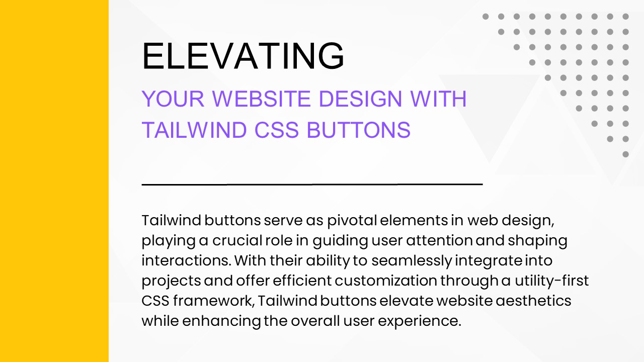
ELEVATING
YOUR WEBSITE DESIGN WITH TAILWIND CSS BUTTONS
Tailwind buttons serve as pivotal elements in web
design, playing a crucial role in guiding user
attention and shaping interactions. With their
ability to seamlessly integrate into projects and
offer efficient customization through a
utility-first CSS framework, Tailwind buttons
elevate website aesthetics while enhancing the
overall user experience.
2
SETTING UP
TAILWIND IN YOUR PROJECT
- Setting up Tailwind in a project involves
installing the framework via npm or yarn and
configuring the tailwind.config.js file to
customize styles. - Once configured, developers can leverage
Tailwind's extensive utility classes to rapidly
create and customize buttons, streamlining the
design process effectively.
3
EXPLORING
TAILWIND CSS BUTTON STYLES
- Default Button
- Pilled Button
- Outlined Button
- Bordered Button
- Disabled Button
4
MORE
TAILWIND CSS BUTTON STYLES
- 3D Button
- Elevated Button
- Group Button
- Icon Button
- Colored Button
5
ENHANCING
YOUR BUTTONS WITH TAILWIND CSS
- Gradient Button
- Banner Button
- Loader Button
- Label Button
- Button Sizes
6
TAILWIND
CSS IN ACTION
- Clean and straightforward, the default style
provides a solid foundation, featuring
customizable padding, text boldness, color, and
rounded corners for a polished look. - Infusing playfulness, the pilled button stands
out with rounded corners and hover effects,
making it an engaging choice for buttons that
need to catch the user's attention. - Adding structure, the bordered button combines
solid borders with vibrant colors, creating
visually appealing styles that capture the user's
eye while maintaining a sense of design order.
7
EXPERIMENT
AND ENHANCE WITH TAILWIND CSS BUTTONS
- The explored array of Tailwind CSS buttons
showcases a versatile range, from the clean and
polished Default Button to the visually engaging
3D Button, each providing a unique aesthetic for
different design needs. - Explore more in our original article
- https//purecode.ai/blogs/tailwind-button/
8
(No Transcript)
Recommended
CrystalGraphics Presentations


