THE EVOLUTION OF WEB DESIGN, IN THE DIGITAL AGE - PowerPoint PPT Presentation
Title:
THE EVOLUTION OF WEB DESIGN, IN THE DIGITAL AGE
Description:
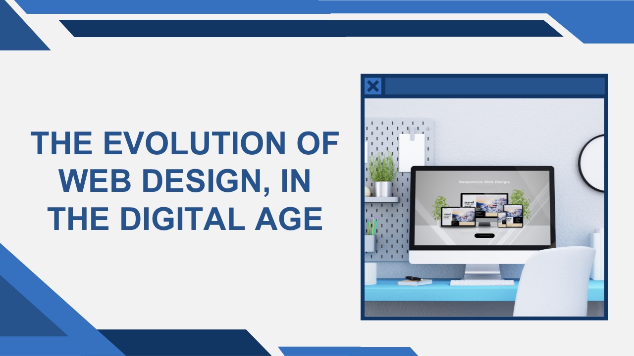
Redefining Accessibility Across Devices The smartphone boom in the late 2000s introduced the need for adaptable websites. Responsive design emerged as the solution, ensuring seamless performance across all devices. – PowerPoint PPT presentation
Number of Views:1
Title: THE EVOLUTION OF WEB DESIGN, IN THE DIGITAL AGE
1
THE EVOLUTION OF WEB DESIGN, IN THE DIGITAL AGE
2
INTRODUCTION
- Websites are digital storefronts offering first
impressions for businesses and individuals. - Web design has evolved significantly, driven by
technology and user expectations. - This presentation explores
- The journey of web design evolution.
- How Framebake Technology, a leading Digital Media
Agency Vancouver, is shaping the future.
3
ROOTS OF WEB DESIGN
- 1991 Tim Berners-Lee created the first website.
- Early websites were
- Text-heavy with basic HTML.
- Static and lacked interactivity.
- Mid-1990s
- Introduction of graphical web browsers (e.g.,
Netscape Navigator). - Aesthetics became important with tables for
layouts and basic graphics. - Businesses began realizing the potential of
websites as marketing tools.
4
THE 2000S MODERN WEB DESIGN EMERGES
- Flash Technology Enabled animations, multimedia,
and stylized interfaces. - Downsides Long loading times and poor search
engine compatibility. - CSS (Cascading Style Sheets)
- Separated content from design.
- Paved the way for cleaner, professional websites.
- Focus shifted to user experience (UX) alongside
aesthetics.
5
- Rise of smartphones demanded adaptable websites.
- Responsive Design
- Uses fluid grids, flexible images, and media
queries to adjust layouts across devices. - Example Desktop vs. Mobile layout
transformation. - Mobile-First Philosophy
- Designing for smaller screens first, then scaling
up. - Ensures faster load times and improved user
experience. - Importance
- Googles mobile-first indexing for SEO.
- A necessity in todays mobile-driven world.
RESPONSIVE DESIGN THE MOBILE-FIRST REVOLUTION
6
DIGITAL MEDIA AGENCY VANCOUVER MINIMALISM VS.
BOLD VISUALS
- Minimalism
- Clean layouts with ample white space.
- Benefits Faster load times, better usability,
and improved SEO. - Bold Visuals
- Techniques like parallax scrolling, video
backgrounds, and micro-interactions. - Adds depth and engagement.
- Framebake Technology combines both approaches to
craft user-centric experiences.
7
AI AND AUTOMATION THE FUTURE OF WEB DESIGN
- AI-Powered Tools
- Website builders generate layouts, colors, and
designs automatically. - Automation in Functionality
- Chatbots Provide real-time support and
engagement. - Personalization Tailored content based on user
behavior. - A/B Testing Continuous optimization of design
elements. - SEO Optimization AI tools enhance structure and
meta tags. - Future Outlook Predictive and self-updating
websites. - Framebake Technology helps businesses integrate
AI-driven solutions effectively.
8
THE ROLE OF ACCESSIBILITY IN WEB DESIGN
- Inclusive design ensures usability for everyone,
including people with disabilities. - Key features
- Screen reader compatibility.
- Keyboard navigation.
- Proper color contrast.
- Accessibility enhances
- Brand reputation.
- Reach and user engagement.
- Framebake Technology prioritizes accessibility in
all web projects.
9
GET MORE Information
Website www.framebake.com
info_at_framebake.com
10
THANK YOU


