How to draw population graphs - PowerPoint PPT Presentation
1 / 8
Title:
How to draw population graphs
Description:
... population ... 1. Type in the population figures from page 6 of 'Minds and ... 3. In what ways do the population trends help the development of the ... – PowerPoint PPT presentation
Number of Views:48
Avg rating:3.0/5.0
Title: How to draw population graphs
1
How to draw population graphs
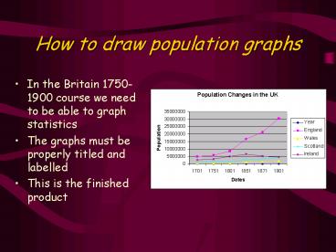
- In the Britain 1750-1900 course we need to be
able to graph statistics - The graphs must be properly titled and labelled
- This is the finished product
2
How to draw population graphs
- Now start Excel. Press AltTab to switch between
programs
1. Type in the population figures from page 6 of
Minds and Machines as shown in the spreadsheet
(click your mouse)
2. Do not type in the totals. Use the sum
function to total each line.
3
How to draw population graphs
- 3. Highlight the table using the mouse (excluding
the total column)
4. Click on the chart icon
4
How to draw population graphs
- 5. Choose the line chart (highlighted)
6. Click on next
5
How to draw population graphs
- 6. In the Wizard step 2 click on the series tab
so that you can direct Excel to the X axis data
(the dates on the graph)
6
How to draw population graphs
- 7. Find the bottom window labelled Category x
axis labels
8. Click inside the box
9. Then highlight the cells A2A7 (containing the
years) The dates will now appear on your graph
instead of 1 to 6
10. Click on next
7
How to draw population graphs
- 11. Type in the chart title Changes in the
population of Britain 1701 to 1901
12. Click on Finish
8
Report based on the population
- Write a conclusion in Word based on the
population graphs. Copy the graph and paste it in
your report.
- Include the answers to the following questions
- 1. What are the trends in the graphs?
- 2. Are there any exceptions? Can you explain why?
- 3. In what ways do the population trends help the
development of the textile industry?


