Elements of Composition - PowerPoint PPT Presentation
1 / 25
Title:
Elements of Composition
Description:
Louise Nevelson Chuck Close Leo & Dianne Dillon Visual Rhythm Visual rhythm is similar to musical rhythm. Multiple units (subjects/shapes/colors/values) ... – PowerPoint PPT presentation
Number of Views:112
Avg rating:3.0/5.0
Title: Elements of Composition
1
Elements of Composition
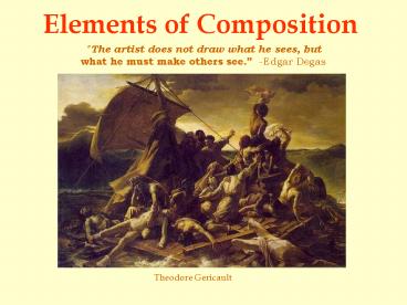
The artist does not draw what he sees, but what
he must make others see. -Edgar Degas
Theodore Gericault
2
Line Shape
- Organizational lines create a loose skeleton to
build a composition. - Circular and triangular
shapes create closed compositional forms, and can
lead the eye by design.
Theodore Gericault
Alfred Leslie
3
Focal points
- Organization of shape and line can create focal
points to draw the eye.
Carravaggio
4
(No Transcript)
5
Emphasis
- Value changes in color (value/intensity) and
lighting (dramatic changes) create visual
emphasis. Emphasis can also be created through
compositional placement, and compositional
isolation.
Odd Nerdrum
Gustav Klimt
6
- Lighting and color emphasis
Alex Ross
Sandy Skoglund
7
Winslow Homer
Jan Vermeer
8
Emphasis by placement
Norman Rockwell
9
Jasper Johns
Dave McKean
10
Patterns Grids
- Repetition of shape/line/color/value creates
visual pattern. - Grids are the base of organization in all design.
- A grid can be used to create containment,
continuity, and unity.
Grid
Amnesty International poster
11
- Pattern
Gustav Klimt
The above image also works within a grid.
12
Chuck Close
Louise Nevelson
Leo Dianne Dillon
13
Visual Rhythm
- Visual rhythm is similar to musical rhythm.
Multiple units (subjects/shapes/colors/values)
are presented in a deliberate pattern
Marcel Duchamp
Gary Kelly
14
- Language and image as poetry
15
(No Transcript)
16
Symmetrical balance
- Occurs when shapes are mirrored on either side of
an axis. These shapes are most often identical.
Ansel Adams
17
Albert Paley
18
Asymmetrical balance
- Creates equilibrium among visual elements that do
not mirror each other. These shapes are often
dissimilar. Depending on the degree of
asymmetry, the resulting design may be stable,
dynamic (energetic), or chaotic.
Gary Kelly
19
Asymmetrical balance
Piet Mondrian
20
- Balance and the psychological effects
- Balance and Imbalance can be used to manipulate
a viewer. - Tilting the picture plane, distorting shapes,
and utilizing symmetrical or - Asymmetrical design can create organization
or chaos.
Dave McKean
Eric Fischl
21
Scale Proportion
- Scale and Proportion greatly effect compositional
balance and emotional impact. Proportion refers
to the relative size of visual elements within an
image. Scale generally refers to the size of a
form when compared with our own human size. - Proportion
Thomas Cole
22
Albert Bierstadt
23
- Scale
- Claus Oldenburg
Frank Lloyd Wright
24
(No Transcript)
25
Compositional Considerations
Be it realism or abstraction Painting,
Architecture, Graphic Design, Photography, or
sculptureThese are the building blocks.
- Begin with a grid layout, and abstract basic
shapes. - Look at successful artists and how they design
their work. - Focal point as a start in design.
- Variety of large and small shapes.
- Unity of color, lighting, pattern.
- Balance both positive and negative shapes.
- Dominant and sub dominant subjects.
- Check visual balance in starting mid-way through


