Bar Graph - PowerPoint PPT Presentation
1 / 13
Title:
Bar Graph
Description:
Tally Marks. Tally marks are used to organize large sets of data. ... The 5th tally mark is drawn as a slash to indicate a group of five. Frequency Chart ... – PowerPoint PPT presentation
Number of Views:285
Avg rating:3.0/5.0
Title: Bar Graph
1
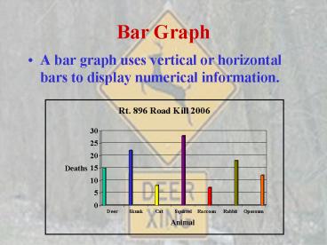
Bar Graph
- A bar graph uses vertical or horizontal bars to
display numerical information.
2
Pictograph
- A pictograph uses symbols to represent data. Each
symbol has the same value.
Key 1 book
3
Line Graph
- A line graph often shows how data changes over
time. Each point represents an item of data.
4
Circle Graph
- A circle graph shows how portions of a set of
data compare with the whole set.The greater the
value of the data, the wider the wedge that
represents the value.
5
Scatterplot
- A graph that shows paired data
Trend
- A relationship between two sets of data that
shows a pattern is called a trend
6
Tally Marks
- Tally marks are used to organize large sets of
data. Each mark represents one time that the
value appears in the data. The 5th tally mark is
drawn as a slash to indicate a group of five.
Frequency Chart
- A frequency chart can help you list the data
quickly. Each value that appears in the data is
followed by the number of times it appears.
Line Plot
- A line plot shows the shape of a set of data.
7
Scale
- The scale of a bar graph is the ruler that
measures the heights of the bars.
Interval
- The interval is the amount of space between the
values on the scale.
Range
- The range of a data set refers to the difference
between the highest value and the lowest value
8
Horizontal Axis and the Vertical Axis
- The lines on which a bar graph are built are the
horizontal axis and the vertical axis.
9
Stem-and-Leaf Diagram
- A graph that shows the shape of the data
according to the data place values. The leaf
of a number is usually the right-hand digit. The
stem is the remaining digits to the leaf.
56 49 47 39 56 47
47 56 45 52 41 40
10
Median
- The middle value in a data set when the values
are listed from lowest to greatest.
Mode
- One of the values appearing most often in a data
set.
Mean
- The sum of the values in a data set divided by
the number of values.
11
Outlier
- An outlier is a number in a data set that is very
different from the rest of the numbers. - An outlier may have a major effect on the mean.
12
Double Bar Graph
A double bar graph is similar to a regular bar
graph, but gives 2 pieces of information for each
item on the vertical axis, rather than just 1.
The bar chart below shows the weight in kilograms
of some fruit sold on two different days by a
local market. This lets us compare the sales of
each fruit over a 2 day period, not just the
sales of one fruit compared to another. We can
see that the sales of star fruit and apples
stayed most nearly the same. The sales of oranges
increased from day 1 to day 2 by 10 kilograms.
The same amount of apples and oranges was sold on
the second day.
13
Double Line Graph
- A double line graph is another way to give a
visual representation of the relationship of data
that has been collected. It is similar to the
line graph. The difference is there are two
lines of data instead of one. - It is made up of a vertical and horizontal axis
and two series of points each one connected by a
line. - The legend will show which line represents what
set of points. Most times a solid line and a
dashed line are used. But varying colors can
also distinguish the two lines apart. - Each point on each line matches up with a
corresponding vertical axis and horizontal axis
value on the graph. - In some cases, you are giving a value from the
horizontal axis and you need to find its
corresponding value from the vertical axis. You
find the point on the line that matches the given
value from the horizontal axis and then match it
up with its corresponding vertical axis value to
find the value you are looking for. You would do
the same type of process if you were given a
vertical axis value and needed to find a
horizontal axis value. - The graph below is a double line graph
The horizontal axis represents the year and the
vertical axis represents profit in thousands of
dollars. The legend towards the top of the
graph indicates which line represents which
product. The solid line corresponds with Product
A and the dashed line goes with Product B.


